Portfolio
1
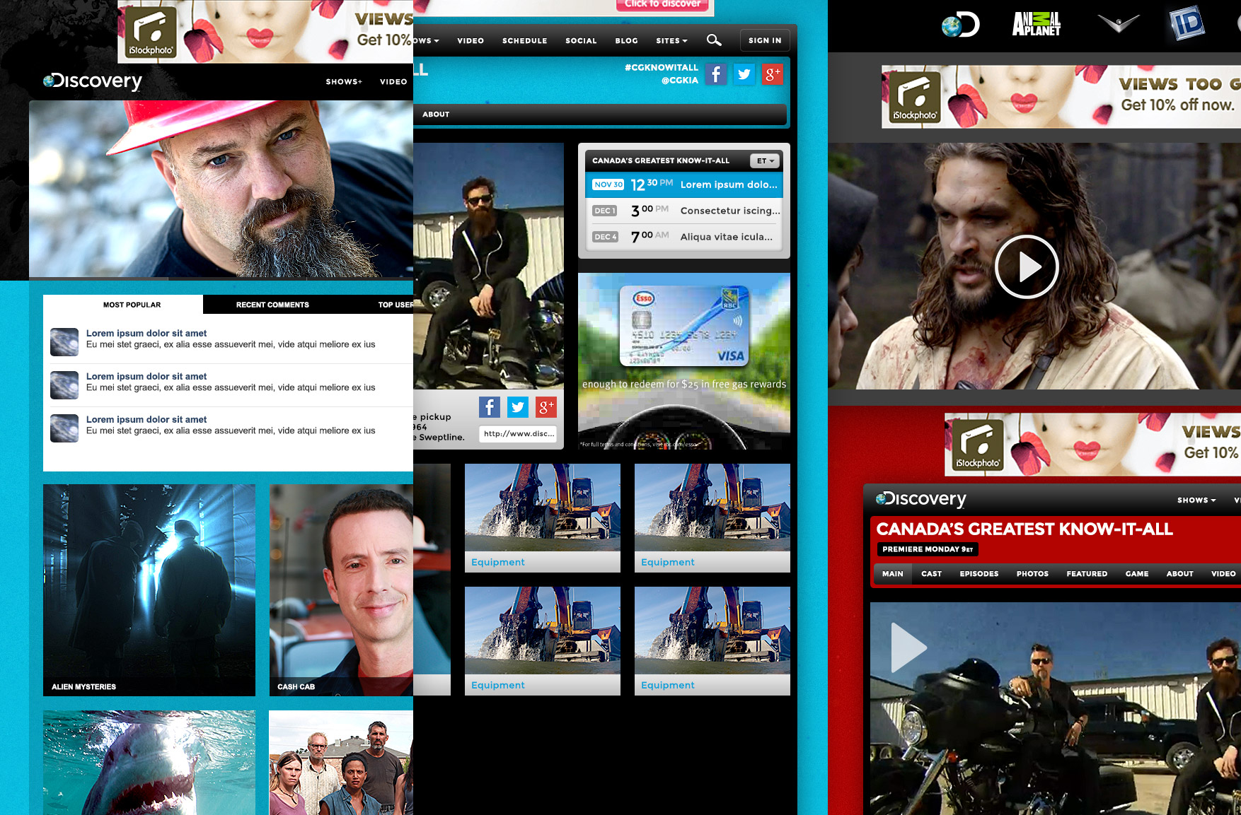
1 discovery website re-design: 5 brands | responsive brand templates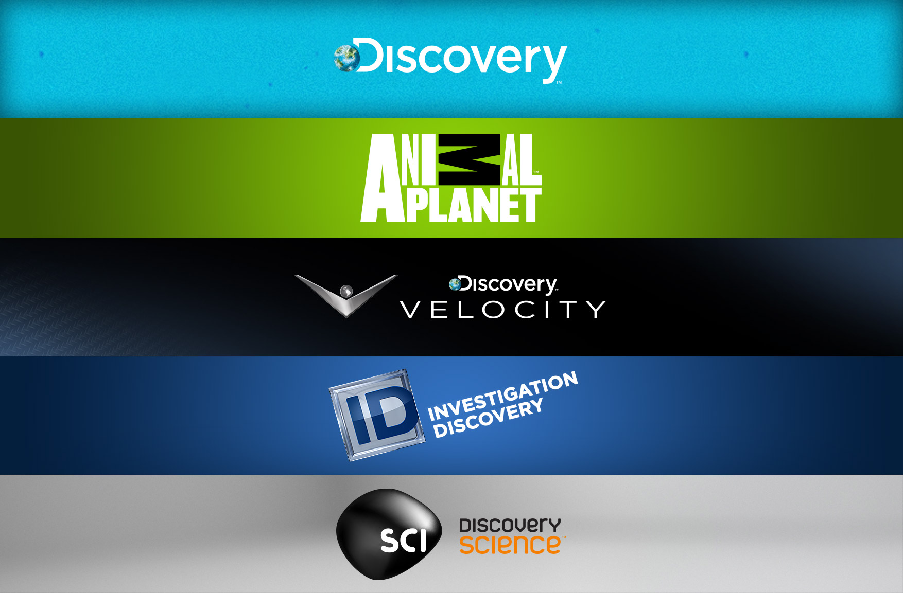 Objectives
With an average of 95K unique visitors per month, we had multiple objectives over 3 phases.
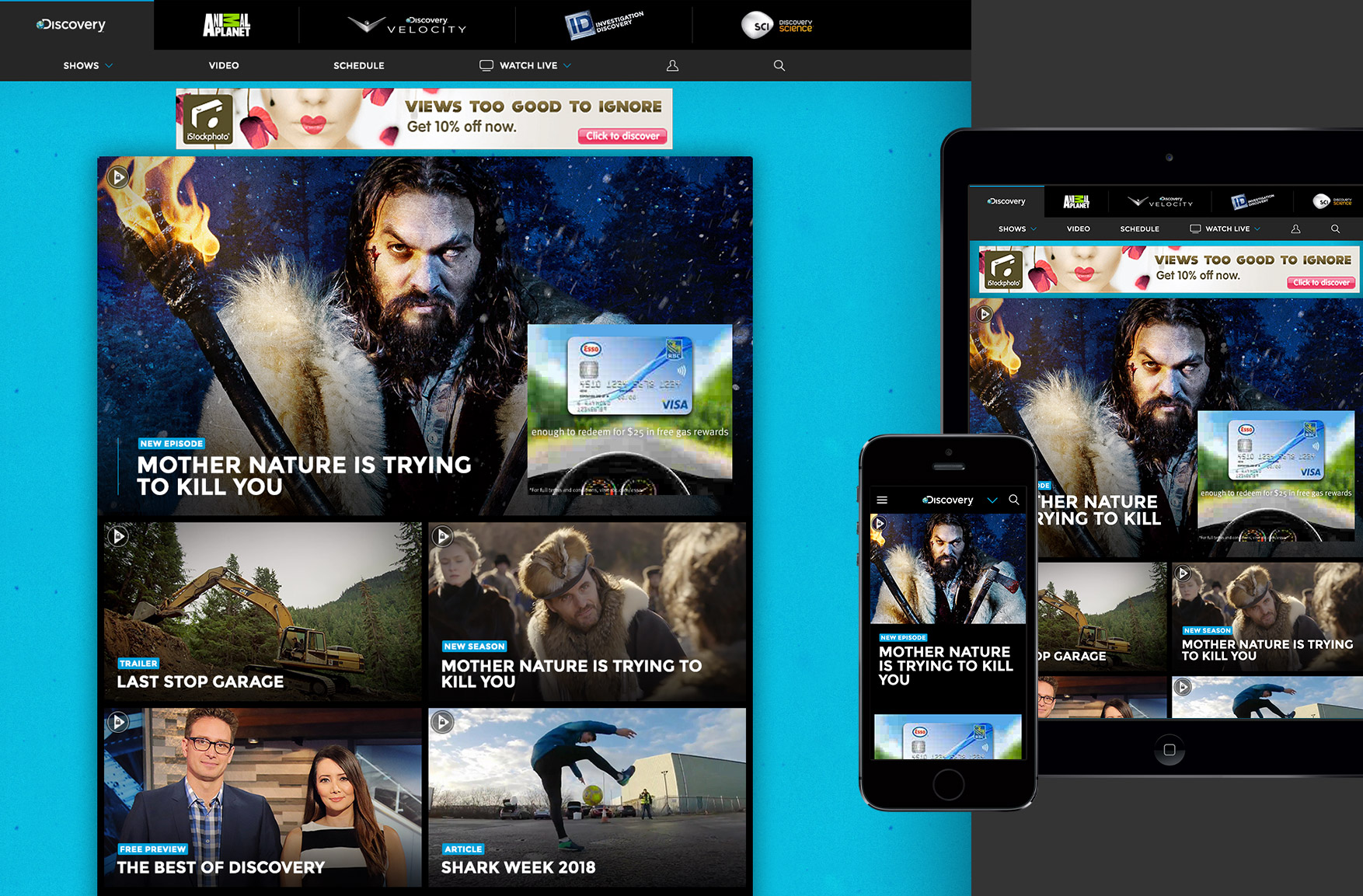
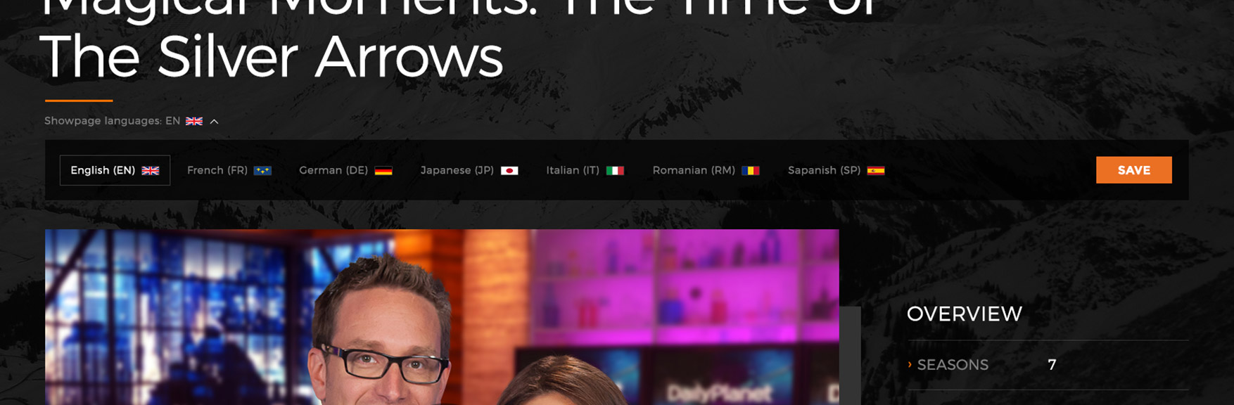
Phase 1 - make the website responsive, 5 brands to use 1 template
Phase 2 - make show pages robust and tiered
Phase 3 - merge 5 brands into 1 hub, merge 5 separate CMS admin panels into 1
Tools
Photoshop, Illustrator, UXpin, Adobe Analytics
Collaboration
Creative Director, Marketing, Front-end dev, Back-end dev, Product, Content, Content producers
 A) Requirements
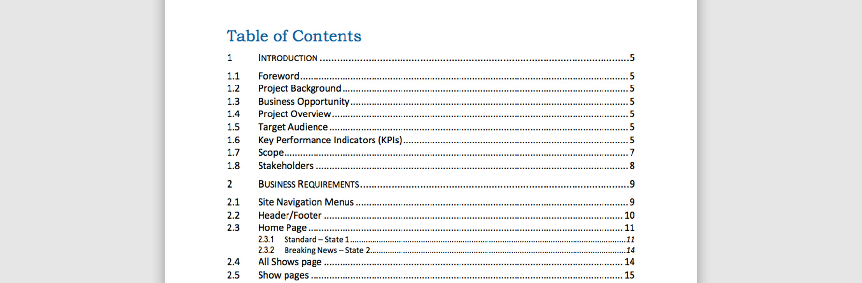
This project started off with a 39 page Business Requirements Document (BRD) which highlighted key topics like business opportunities, target audience and key performance indicators. It also detailed all the sections of the website and this was essentially a large checklist for me to comb over.
 B) Analytics
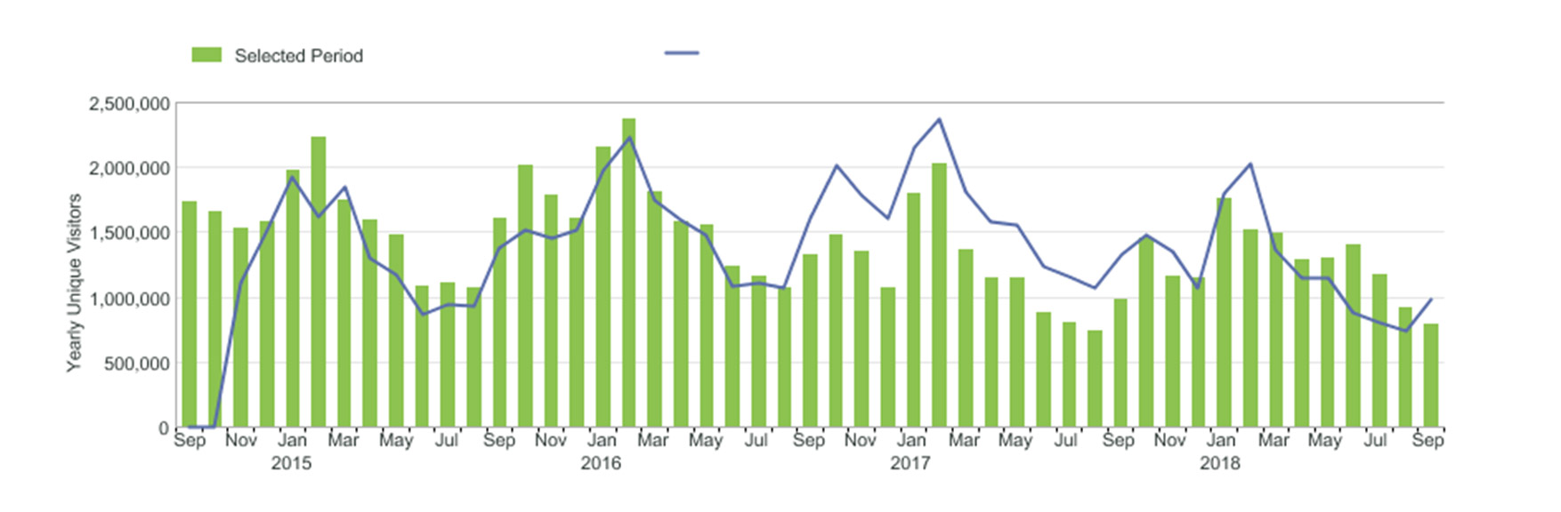
We used Adobe Analytics to get browser stats, screen widths, device types, etc. I found that the majority of our audience, for mobile, are keen on apple products and, for desktop, widths were in the 1280px range.
 C) Sketches
I did several sketches to get key ideas I was visualizing down on paper so I could show others, tweak and have a starting point.
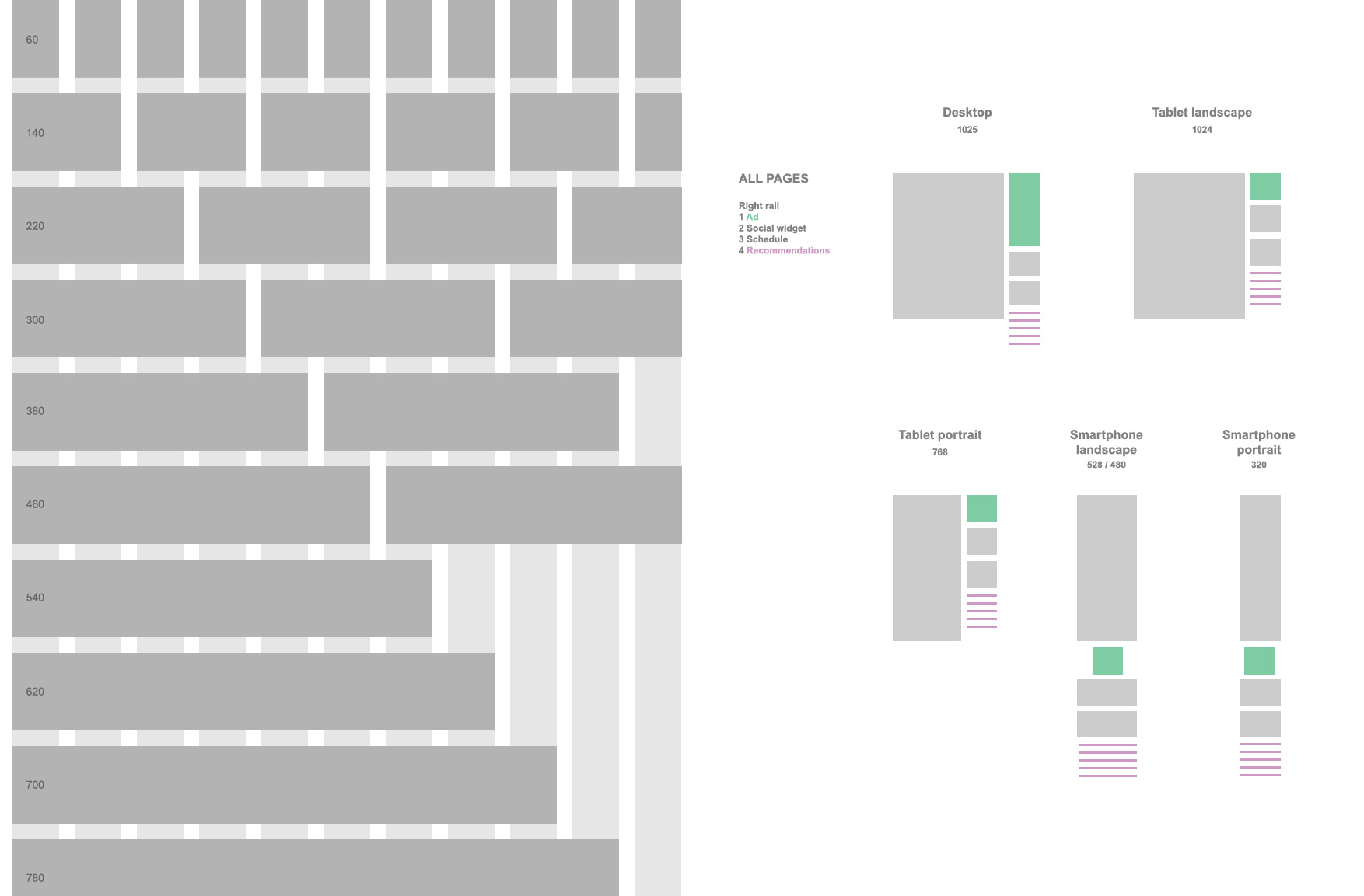 D) Grid
We have to establish a grid so dev and design can have a common framework. We also have to consider where the leaderboard and big box ads are positioned around the content and those normally require visibility above a 600 or 800 pixel fold for revenue purposes.
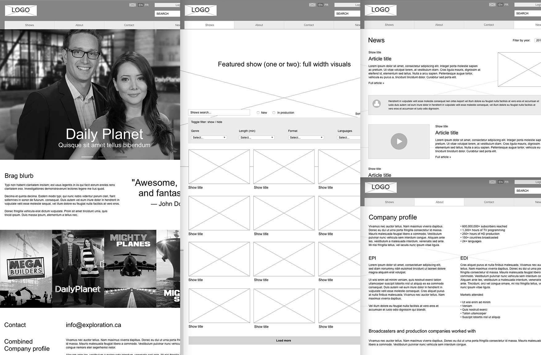
 E) Wireframes
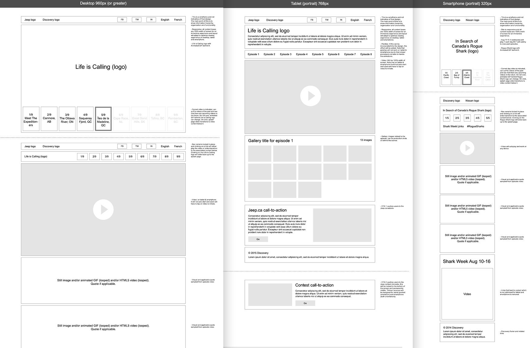
I created wireframes (responsive, interactive, as well as non-interactive) in order to position the content based on information hierarchy and to get a good understanding of user flow. It helped us get closer to finalizing functionality and insert anything we may have missed. We worked with dev to make sure they could program it and Product and Content to make sure their goals could be achieved.
 F) Early mockups
Over the course of 3 phases, there were 64 versions of key mockups before the final design. The general process is that we continually criticize our work until there is very little left to complain about and the project becomes very refined.
 G) Final mockups
The final mockups need to be ready for production, so they are pixel perfect, all gutters and spacing follow a logical grid.
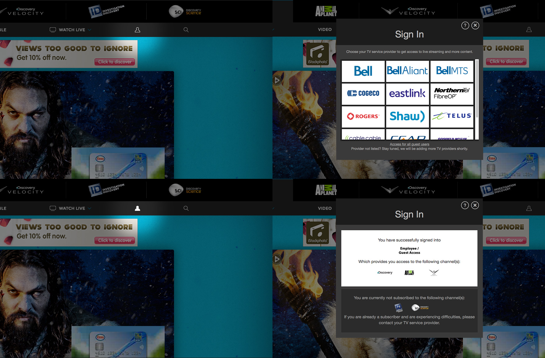 H) UX feature: Sign in
For sign in, the key features we wanted were: 1) It is clear to the user when they are signed in or signed out. For being signed in, the icon is filled in and for being signed out, the icon is not filled in. 2) The user knows which channels they are subscribed to and not subscribed to. This is so they can navigate to the content to watch online and also potentially be enticed to sign up for what they are not subscribed to. After signing in, a popup window with channel logos reminds them of their subscription(s).
 I) UX feature: Hub navigation
We used the same template for 5 brands and had colour accents to differentiate each one. The nav uses a tab system which is simple but extremely effective at showing the current brand and encouraging cross-pollination to the other brands. Lastly, the nav is persistent on the page so the user can easily jump to any link or brand.
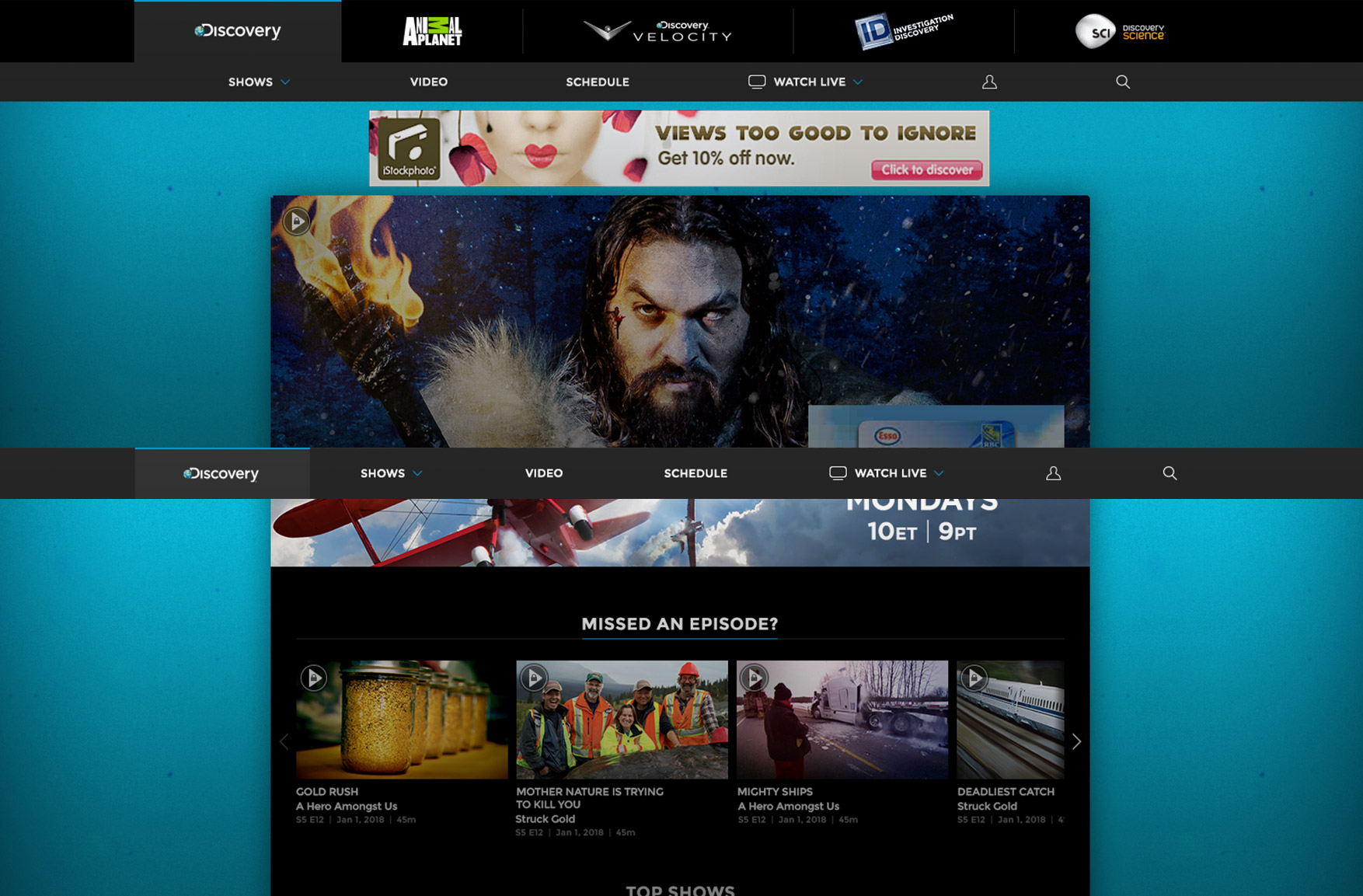 J) UX feature: Content area
To increase content absorption, we maximized the main page area by shrinking the nav height. Upon scrolling down, the main nav will minimize into a thin bar giving better visibility to the main content and, when scrolling up, is re-sized to full height. In minimized view, only the current brand logo appears.
 K) UX feature: Shows menu
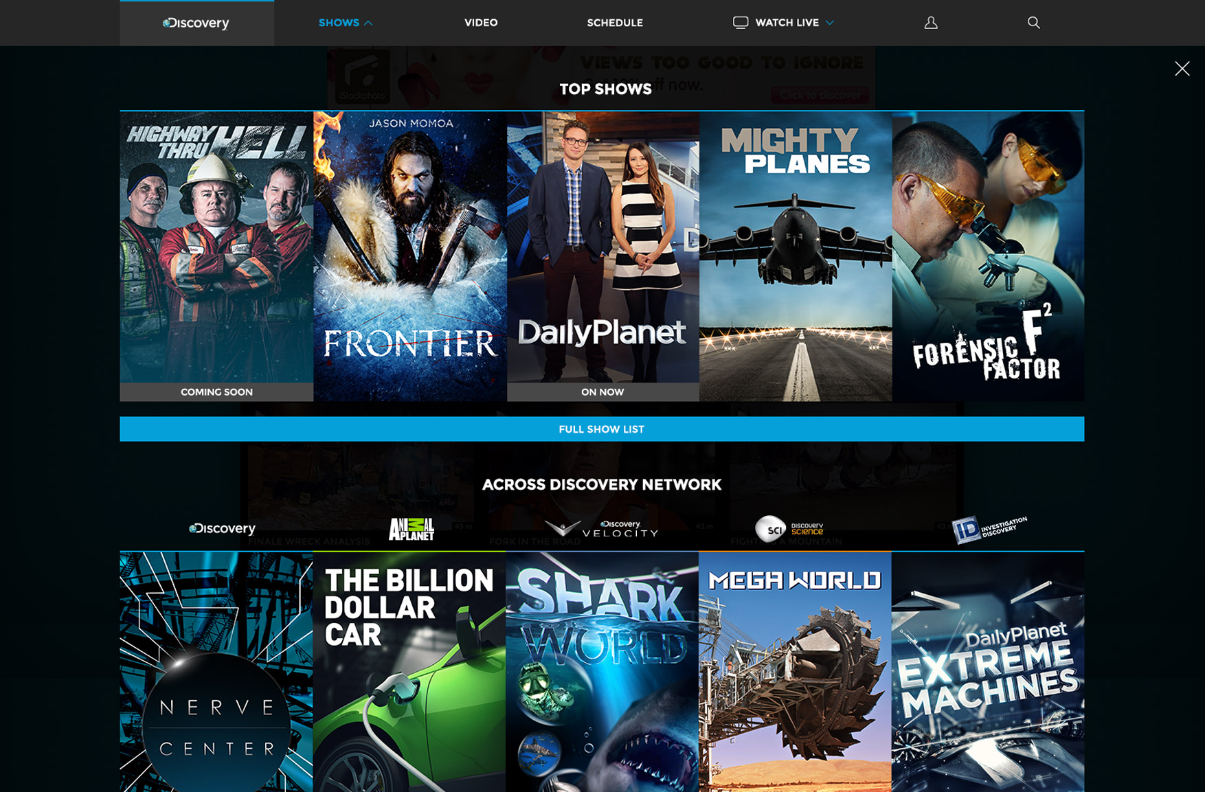
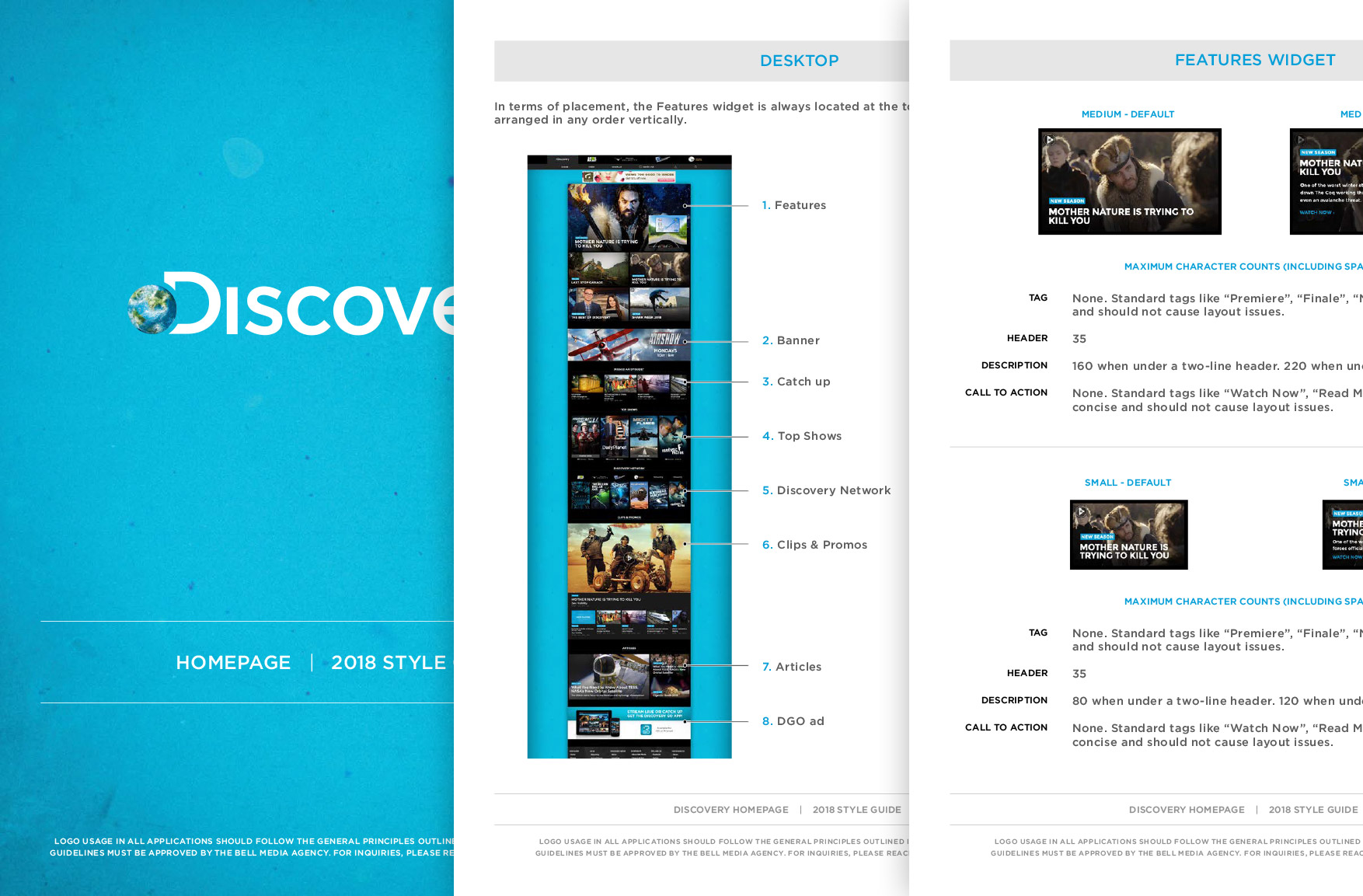
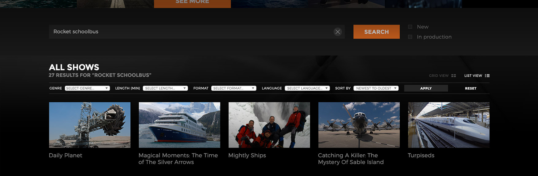
We wanted to really drive users to our top shows and cross-pollinate the 5 brands. Typically, a shows menu would have an alphabetized text list of all shows. But instead, we favoured large eye-catching posters to promote our top shows. A button linking to the alphabetized list is available for those interested in a specific show not on the top list. On smartphone and tablet, we found it easier to tap a poster than to tap a text link list.
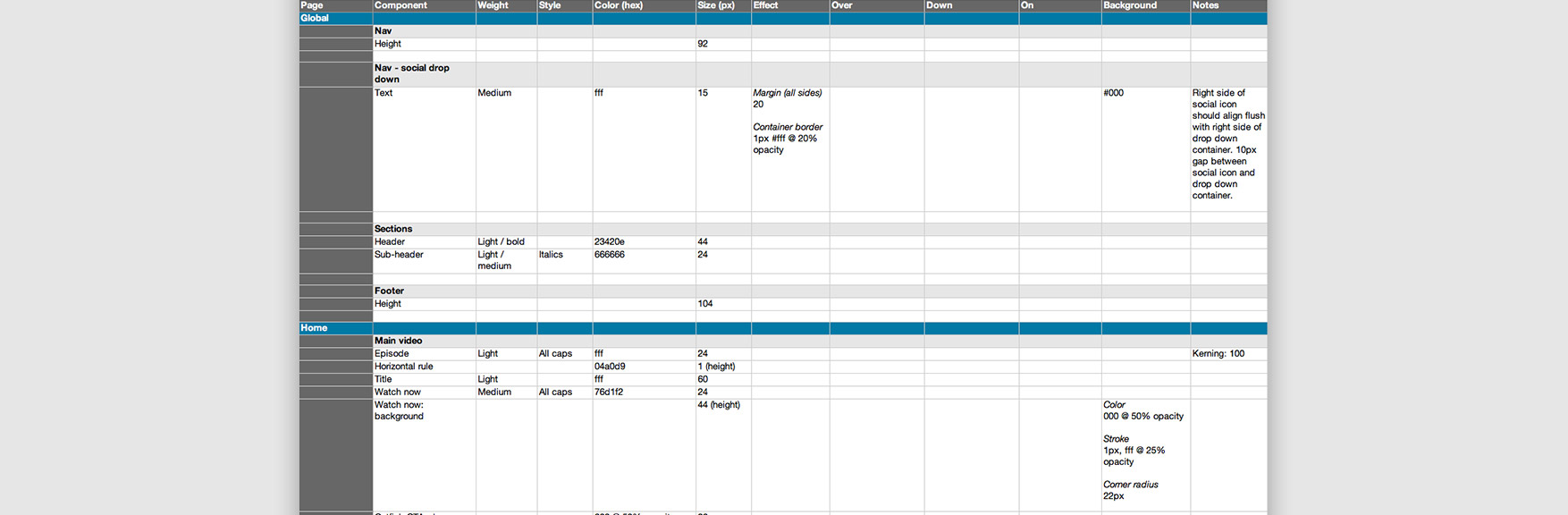
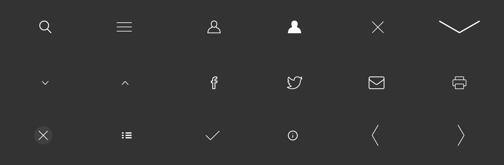
 L) Dev style guide
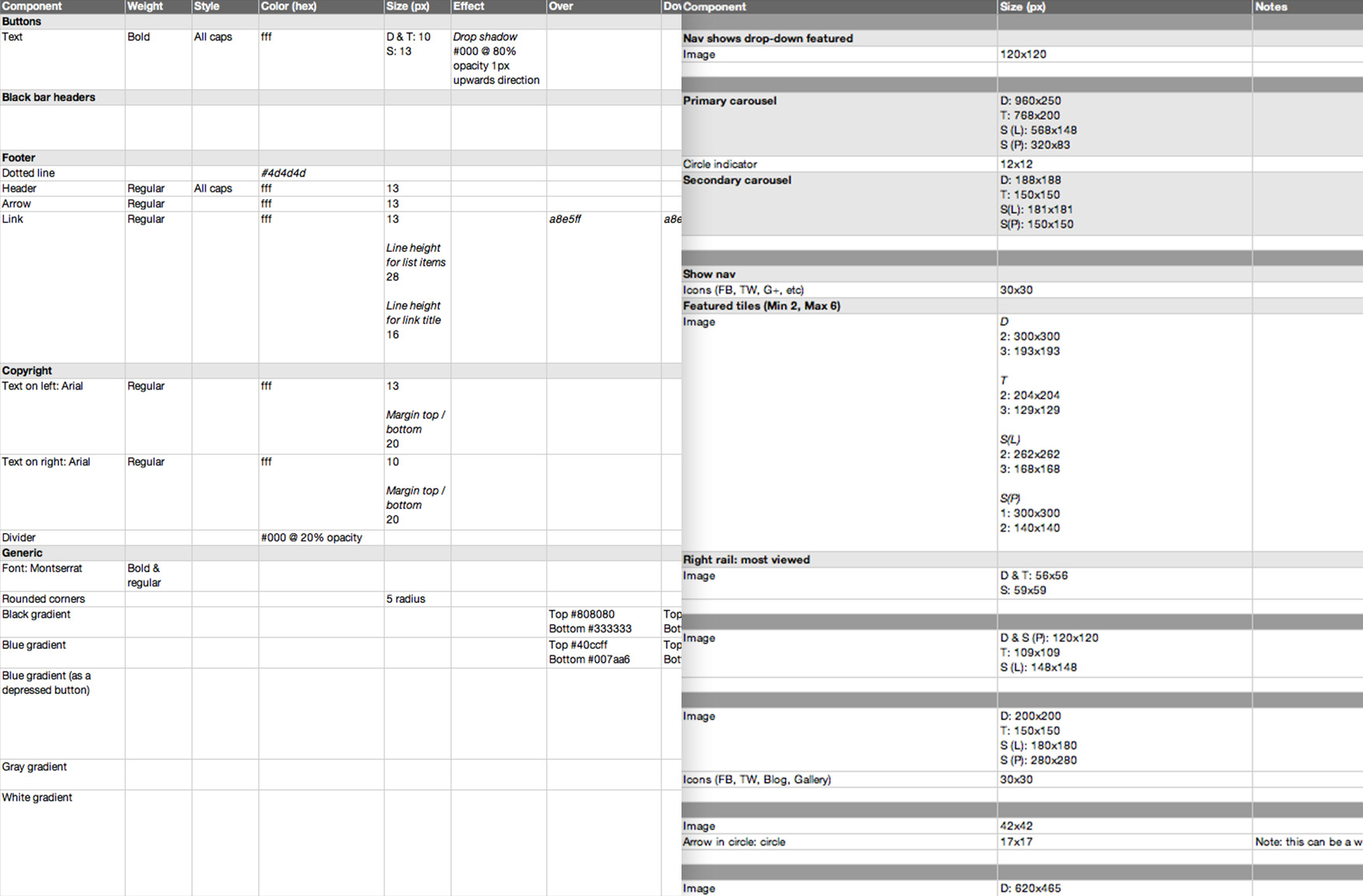
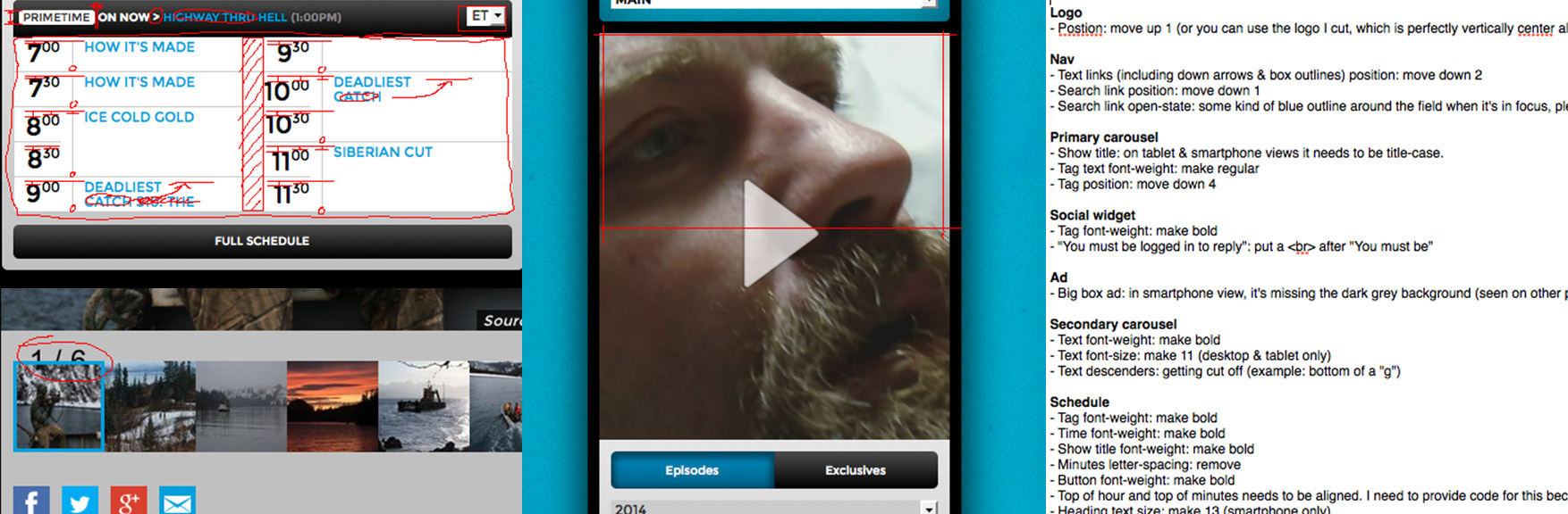
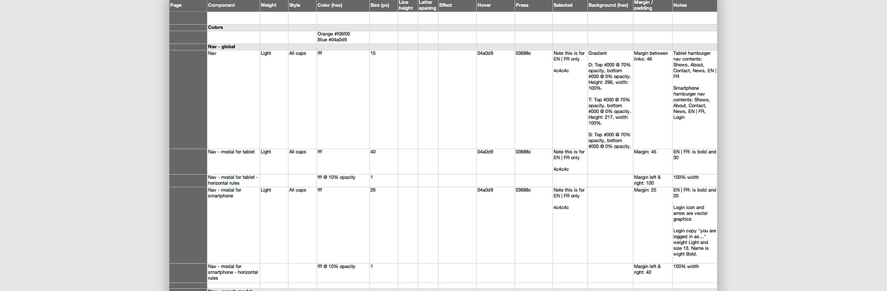
Consisting of 1,015 lines in an Excel spreadsheet, this specified all the styles of every page, element, font and interactive state (such as hover, press, visited, etc) in order to streamline development. For animations, live examples were provided so art direction was totally clear. I worked closely with dev to make sure they understood and sometimes, because of dev limitation, we made alternate solutions on the fly.
 M) Design QA
For Design Quality Assurance (DQA), I needed to make sure what dev created matched the production mockups. We used JIRA to issue tickets and rank their priority to keep the process organized for dev.
 N) Post-launch
After launch, we typically look at our stats to monitor the success (or failures) of our designs. We noticed a spike in general site traffic by about 30%. The Content Management System (CMS) was reworked so that instead of having 5 separate admin areas for 5 brands, there was 1 admin area for 5 brands, making it easier to manage. I created style guides and PSD templates for designers to help create graphics and for content producers help manage the CMS.
final thoughts
My biggest regret was making it adaptive instead of fluid. The day we made that decision, the majority of us on the team decided to play it “safe” for the sake of the design, grid and ad units. Later I realized that that almost any layout, including ads, can work as a fluid website. Otherwise, I am quite pleased with the outcome.
2
2 Mighty Planes: Paper Planes | Guerrilla Marketing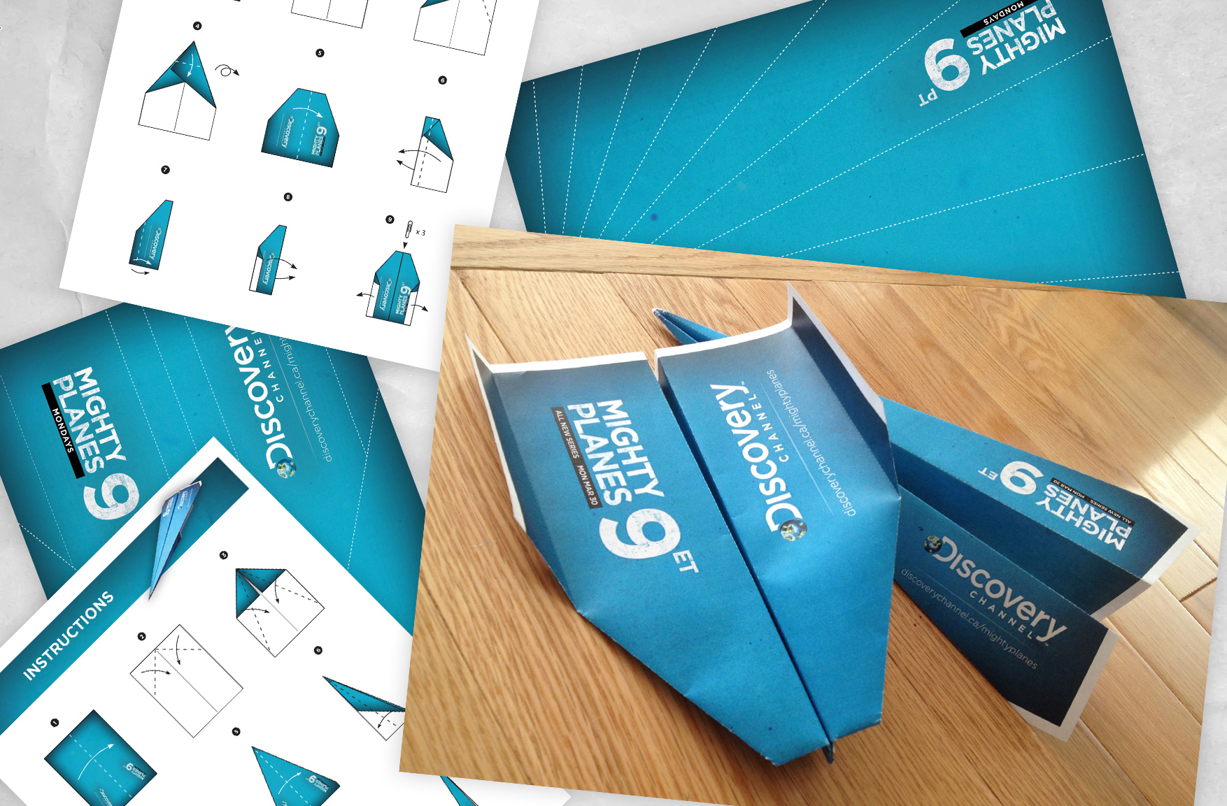 Tools
Tools
Photoshop, Illustrator
Collaboration
Creative Director, Marketing, Front-end dev, Content producers
Cost is always a concern and so my challenge was to promote the show by creating something fun and creative without expenditure. I thought it would be a great idea to make theme relevant downloadable PDF paper planes to print, fold and throw around the office!
3
3 Rogue Shark | Custom Webisode Site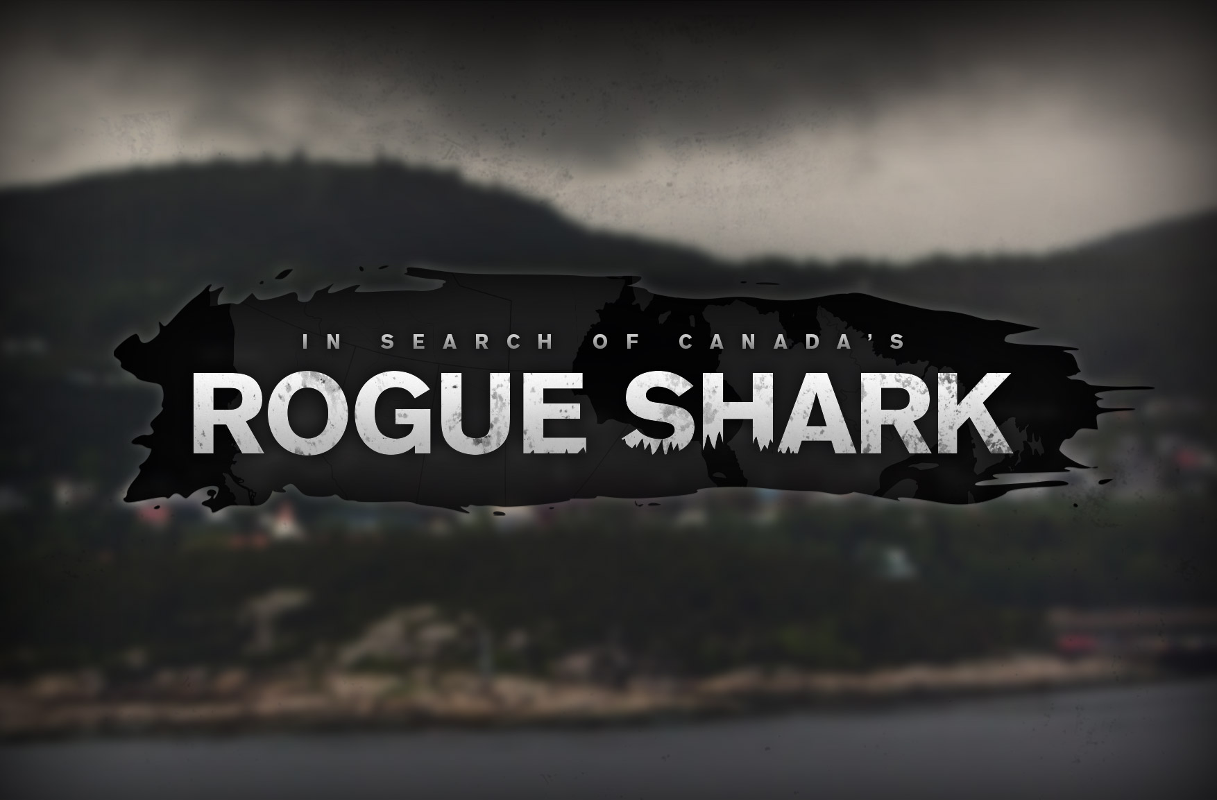 Tools
Tools
Photoshop
Collaboration
Creative Director, Marketing, Front-end dev
 This microsite featured a webisode mini-series that sought to answer the question “can sharks exist in The Great Lakes?”. With comedic host Teddy Wilson and scary sharks, the tone was a blend of light comedy and dark mystery. I used desaturation and grunge textures to convey this. In the sponsored Nissan vehicle, the host travelled to various locations across Canada to interview experts. I used the country map and subway-like nodes to simultaneously display location progress and video progress. I also created the logo.
4
4 Frontier | Engaging story-telling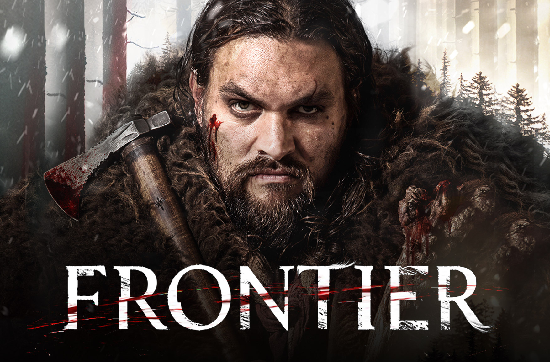 Objectives
This being Discovery Channel’s first scripted drama, and featuring Hollywood heavyweights like Jason Mamoa (Game of Thrones, Batman V Superman, Justice League), marketing this was our highest priority. We wanted to: 1) To inform the user about a brand new show via an immersive and engaging ad 2) Excite and tease the user without overwhelming or giving away story. And 3) Leverage Canvas, which uses the Facebook App and is available in the newsfeed, a section that gets average visits of 1 billion people each day.
Tools
Photoshop, Illustrator, Adobe Analytics, Facebook Canvas
Collaboration
Creative Director, Marketing, Product, Executives
 A) Brief
We started off with the marketing brief which gave us background on the show and the key goal to tell an engaging story using Facebook Canvas. The Discovery audience are mostly ages 18-35 and skews male. Considering this we had to envision what it would be like to go through an interactive ad on your phone and asked ourselves: How much is too much? What works for a short attention span? And do we provide history notes for a historical show?
 B) Facebook specs
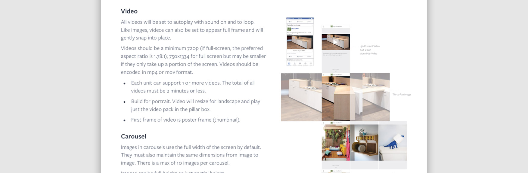
Facebook offered 6 components to work with and image resolutions needed to be 300% pixel density to look good on most devices. The tilt-to-pan image could be 3-5x the width of the screen and videos were a minimum of 720p in MP4 format at 2 min or less. There were also options of using an image carousel, text and buttons with various styles and settings.
 C) Wireframing
We started off with sketching on a whiteboard. Once we had the pages we felt we needed, I did some rough mockups, printed them out on letter paper and we stuck them on the wall the get a visual of what we had. We re-arranged the printouts until we were happy with the user flow. I then used that structure to create a PDF that had three versions for marketing to choose from and provide feedback.
 D) UX feature: balanced information
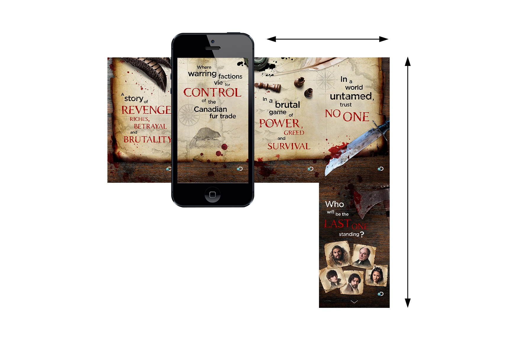
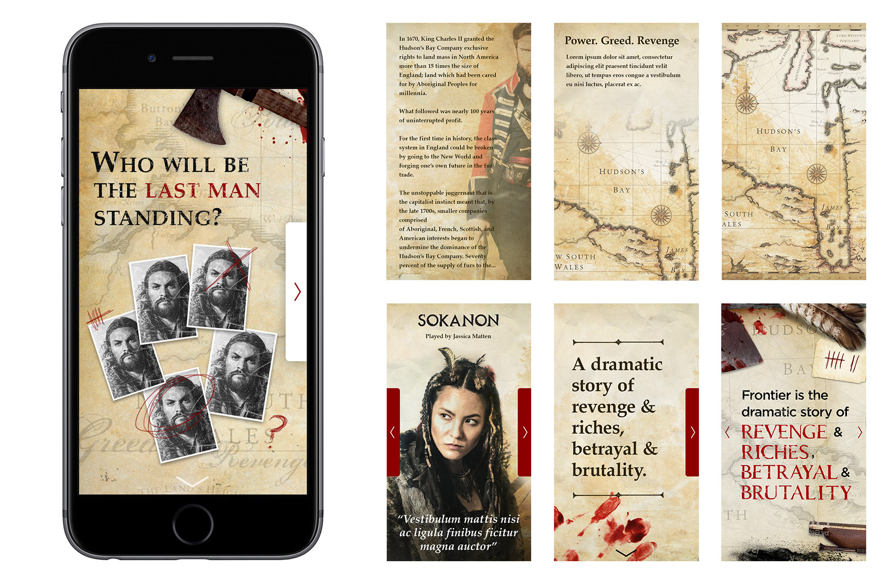
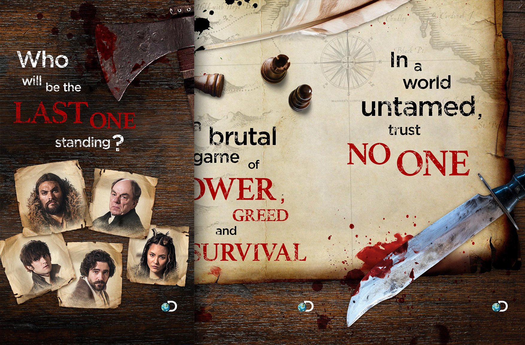
This show is rooted in major Canadian historical events regarding the Hudson’s Bay fur trade and we had to ask ourselves: Do we include this or not? How much is too much? We were worried that it may overwhelm and bore some users, so because of the potential loss of audience we decided to not include this. Instead, we used an extremely concise, general show synopsis and let the graphics convey the historical aspect.
 E) UX feature: skipping
In addition to help user retention, we chose to use the “gallery” component in two sections so that if you wanted more information in the current section you could scroll horizontally, but if you wanted to move to the next section you would scroll vertically.
 F) Final wireframes
The final screens were narrowed down based on an experience we thought was balanced between giving interesting information but not overwhelming the user.
 G) Rough mockups
For the rough mockups, we mainly narrowed down how much information we wanted on each page and to make the typography as interesting as possible. We decided that the size, shape and colour of buttons should be minimal and not overwhelm.
 H) Final mockups
The resolution had to be 300% pixel density and I used stock photos to fit in with the feeling of the show (historic, gritty, bloody, raw, dramatic).
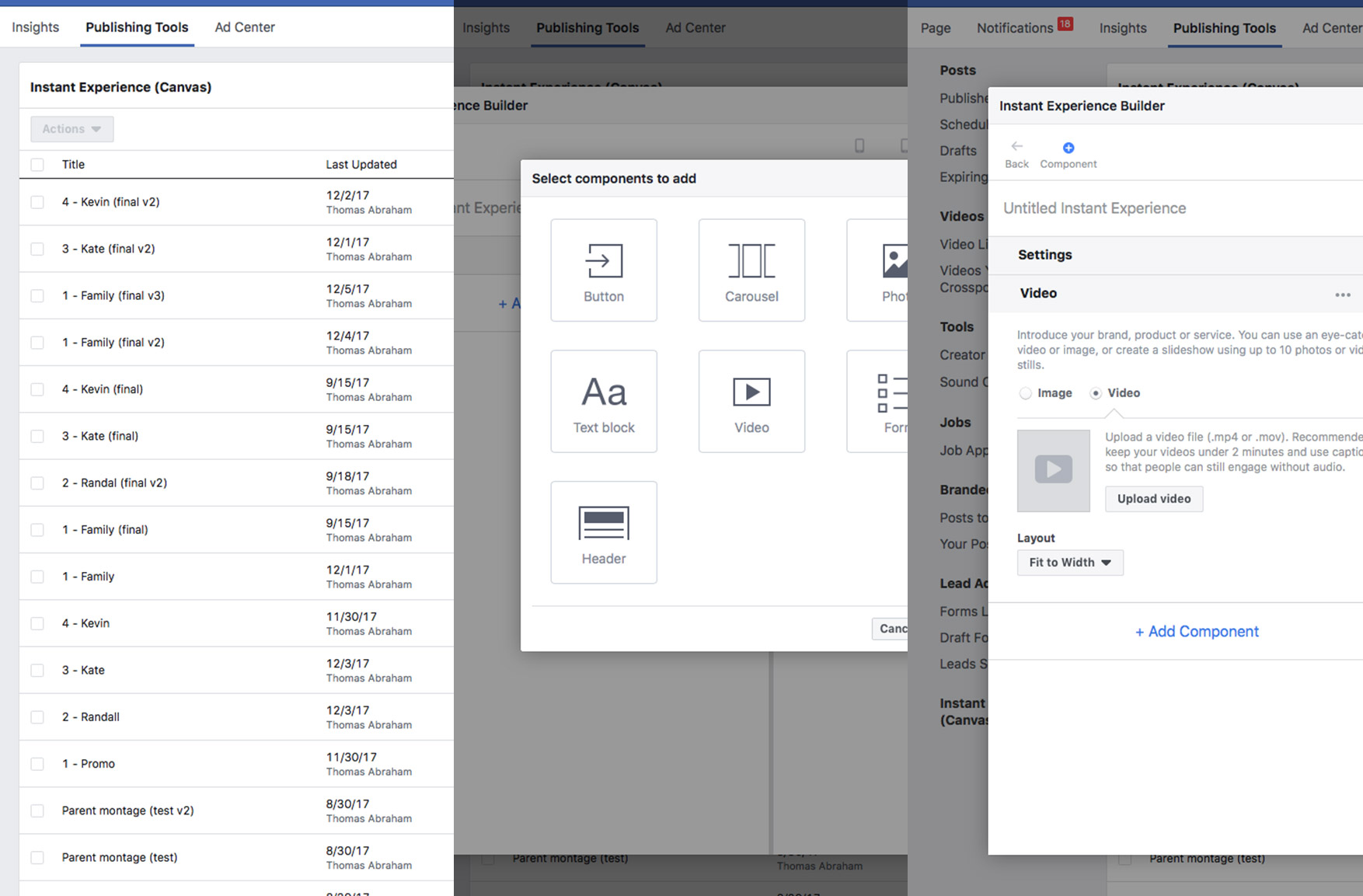 I) Publishing
I learned how to publish content on the FaceBook Canvas platform. By test publishing to ourselves, we were able to do checks and tweaks of the final product before going live. Two weeks after launch marketing said that we preformed very well and achieved a 1.2 million reach and 2.8 million impressions with engagement rate of 18%.
final thoughts
I was really happy with the outcome and very much enjoyed the process. I think the user experience was balanced well for the goals it set out to achieve.
5
5 Shark Week | Marketing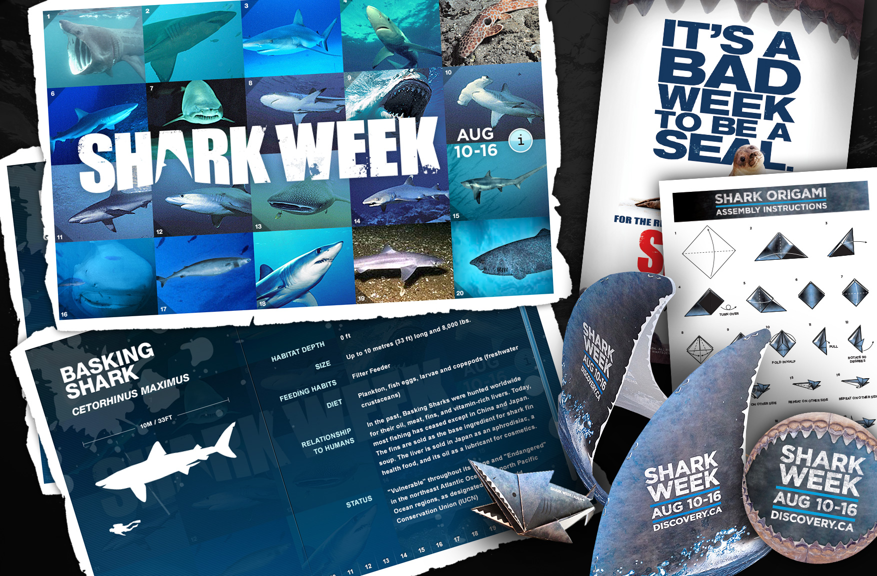 Tools
Tools
Photoshop, Illustrator, InDesign
Collaboration
Creative Director, Marketing, Content producers
Every year we would design something new to promote Shark Week. Ranging anywhere from interactive infographics, to posters, to shark fin hats, to shark origami, this was one of the more flexible and fun projects to express our creative ideas and love for Shark Week.
6
6 Homepage Takeovers | Front Page Marketing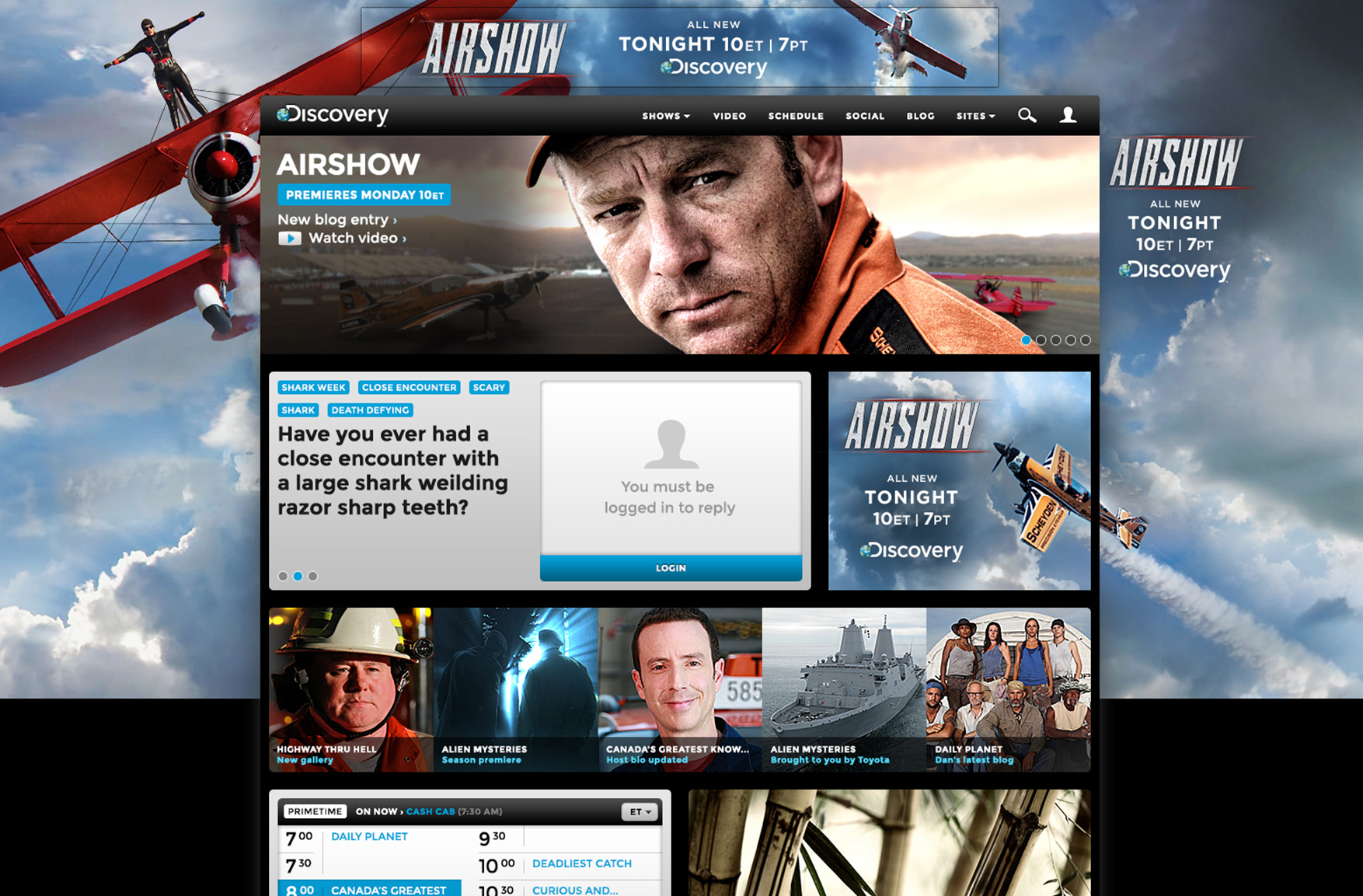 Tools
Tools
Photoshop
Collaboration
Creative Director, Marketing
The objective was to create cohesion between the leaderboard, big box and wallpaper. At the same time, the leaderboard and big box had to work independently if needed. We eventually decided to keep the messaging in the leaderboard and big box only which simplified things and made the messaging more effective.
7
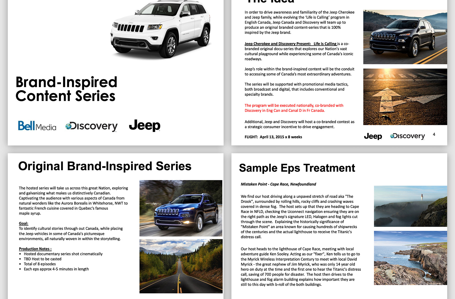
7 Life Is Calling | Brand Partnership Objectives
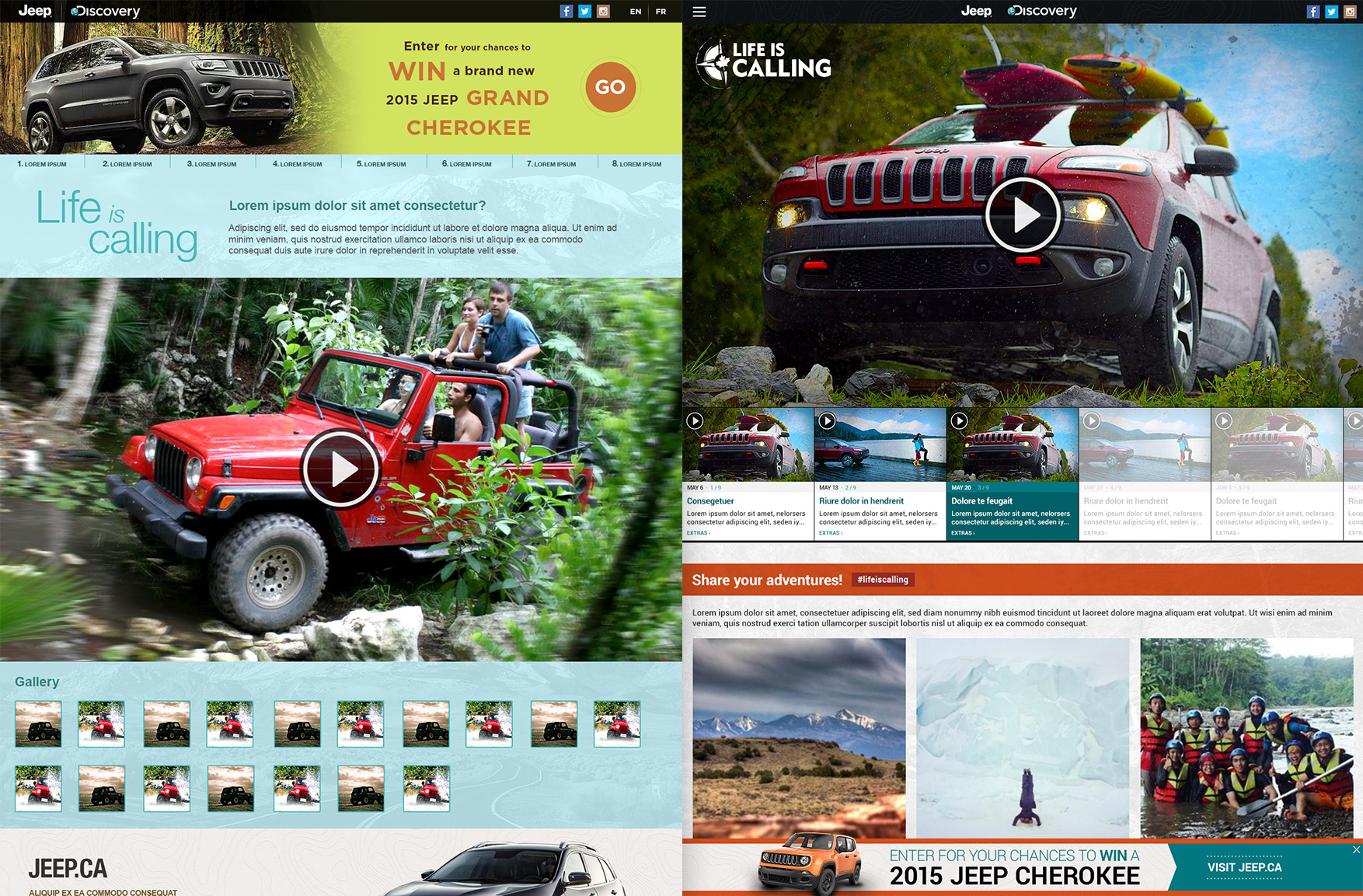
A good portion of the Discovery audience are prone to nature and exploration. Marketing decided to match us to a brand with a similar audience, Jeep, in order to create a brand partnership with the goal of potentially converting Discovery users to Jeep customers. We achieved this by filming an original documentary series with two expeditioners that explored Canada’s cultural and natural beauty inspired by the Jeep brand. We put the series on air and on a fully responsive website with additional content available both in English and French. Another added incentive was a contest to win a Jeep.
Tools
Photoshop, Illustrator, Adobe Analytics
Collaboration
Creative Director, Marketing, Product, Jeep, Content Producers
 A) Marketing brief
The marketing brief went over various details: production costs, episode treatments, incorporating the Jeep brand, promotional tactics, timelines, etc. There were quite a lot of things covered thoroughly and my responsibility was the online interactive experience.
 B) Wireframes
The wireframes were quite standard and covered things like information hierarchy, user flow and various device sizes.
 C) Jeep brand guides
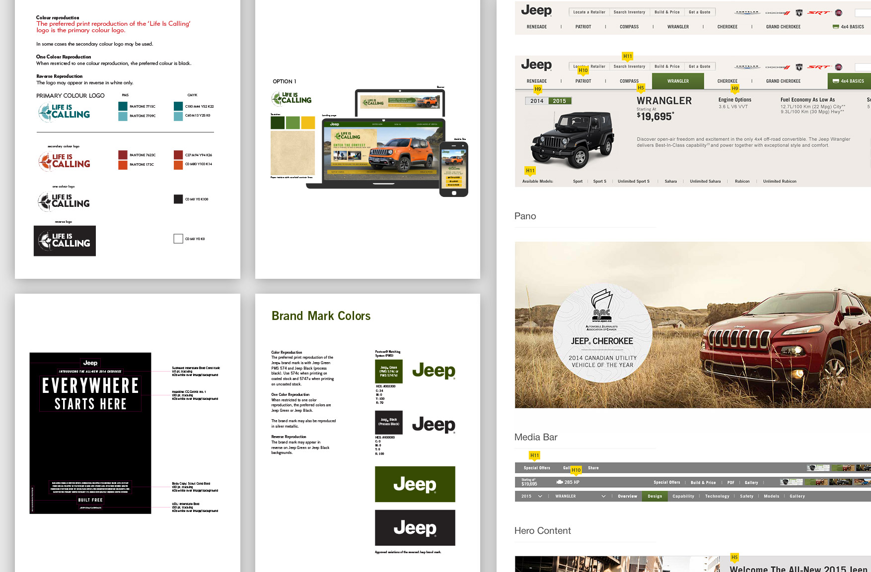
Jeep provided us with brand guidelines for both “Life Is Calling” and their general Jeep brand. I had to take these and adapt it to a responsive website framework. The look I created was roughly 80% of the Jeep / Life Is Calling brand and about 20% of the Discovery brand.
 D) Rough mockups
As we fine-tuned the design, there where two principals we had to follow: 1) The Jeep and Life Is Calling brands had to be visible and clickable at all times and 2) The video experience had to be large and immersive.
 E) Final mockups
For the final design, we decided on a clean approach that allowed the beauty of the nature visuals to come across as much as possible. Also, every element was designed with a flexible height to accommodate for the sentence length variations between English and French.
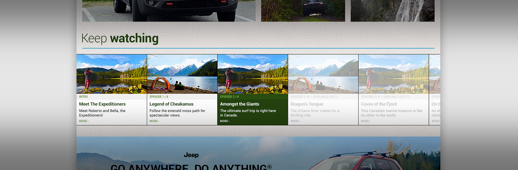
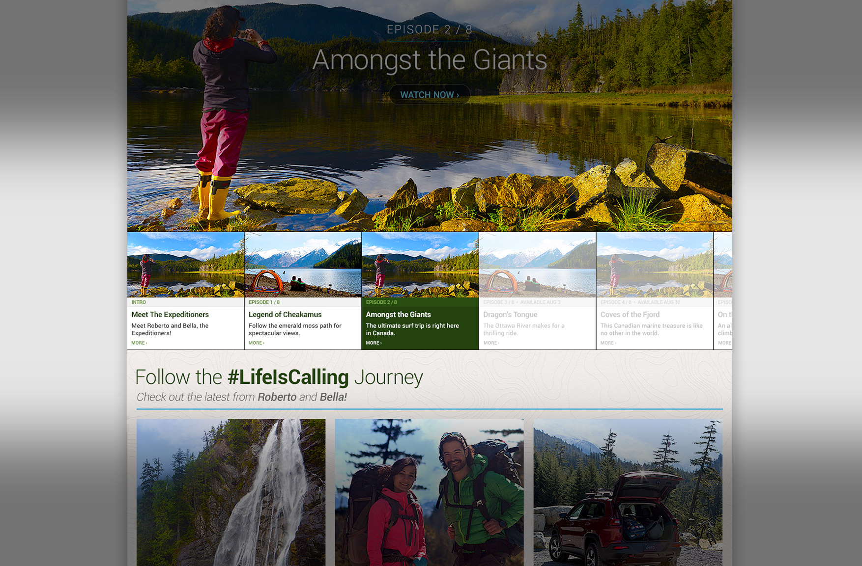 F) UX feature: Navigation (video)
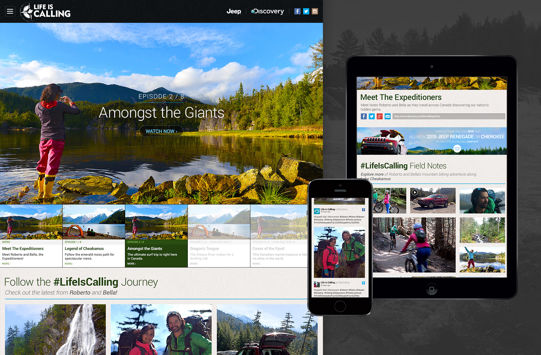
Since this was an 8-part cross-Canada video series campaign, the video was the star of the show and navigating to it was an extremely important usability aspect. Past, current and upcoming videos were clearly demarcated. Past videos were full colour, the current video highlighted in green to stand out and upcoming videos greyed enough to read and also look inaccessible. Upcoming videos also included their air date.
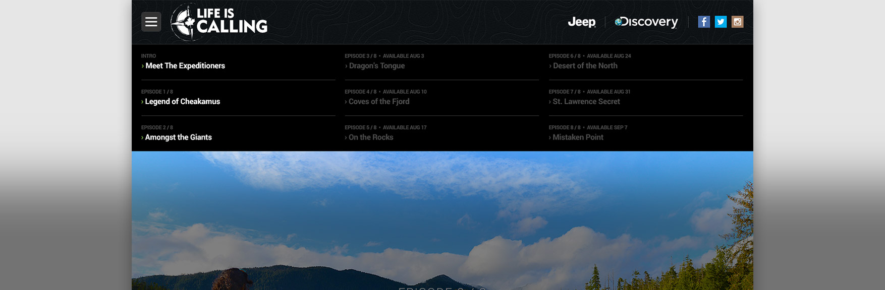 G) UX feature: Navigation (drop down)
Similar to the video navigation, this was a text-only, alternate path to the videos. We felt this redundancy was necessary to cover people who are used to more traditional methods of navigation using a drop-down.
 H) UX feature: Social
We really pushed social on the page to promote the Expeditioners, Discovery and Jeep. There were social links in the global nav, above the footer and directly below the main video to make it as easy as possible to access. The Expeditioners social feeds were also plugged into all pages of the website to keep the content fresh.
 I) UX feature: Video
After finishing watching the video, we used a “keep watching” widget to promote the other episodes in case the user wanted more.
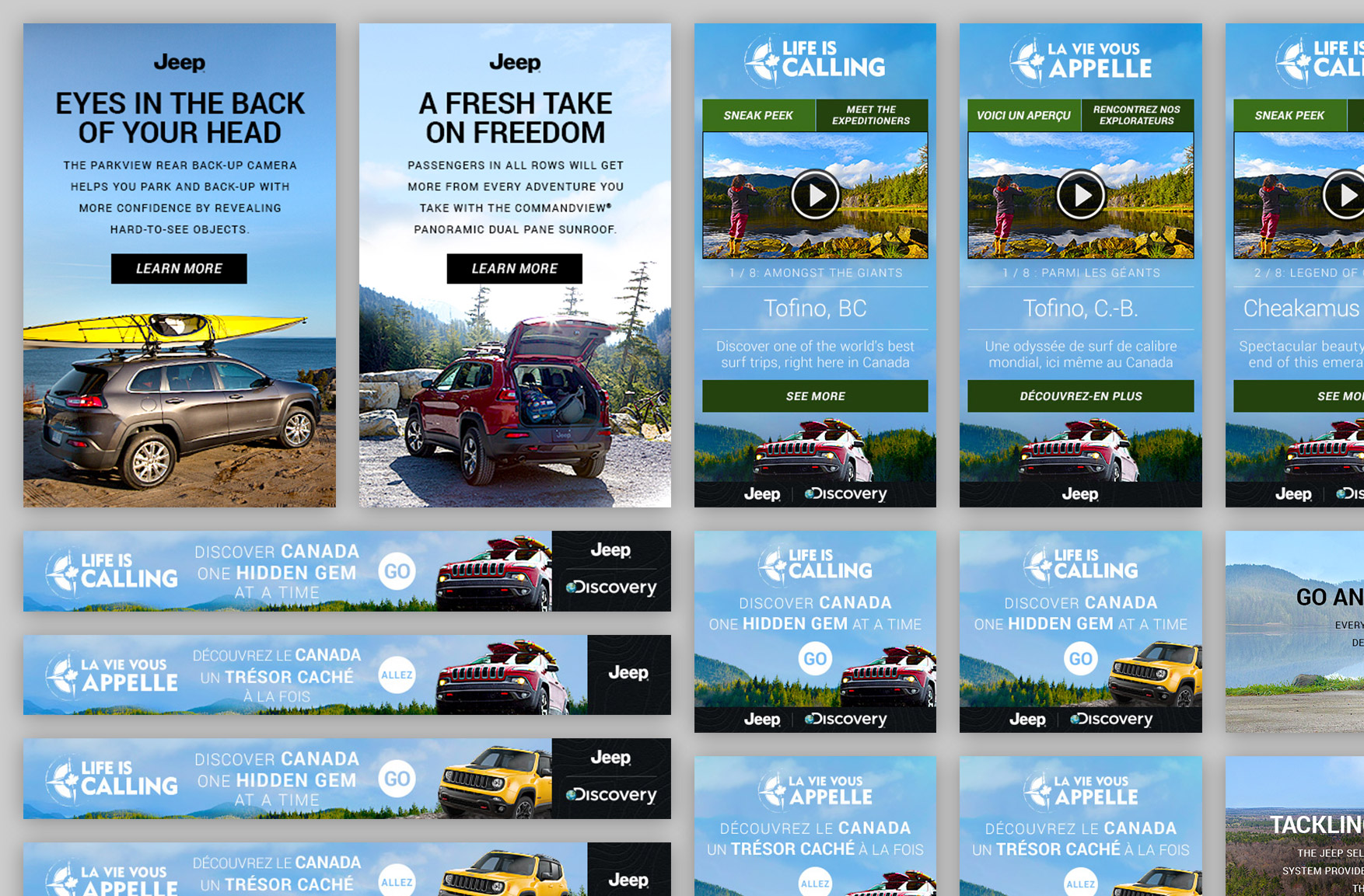 J) Marketing ads
I had to create a series of marketing ads in various sizes to promote the series and contest online. Some ads highlighted car features and some offered video teases of the series.
 K) Dev Style guide
With 225 lines of specification, I created an Excel spreadsheet to make it easy for the front end developers to create all of the visual elements, grid and animations as we envisioned. The style guide included hover states, colour, font size, font weight, font family, etc.
 L) DQA
Before launching, I did Design Quality Assurance (DQA) to make sure the coded work matched with the mockups. Assuming there is enough time, I like to make it pixel perfect.
final thoughts
Even though it was a marriage of 3 brands, the design turned out well and I was quite happy with the final outcome. I felt like this project really made me think about varying languages and how that impacts design.
8
8 BarDown | Unconventional Branding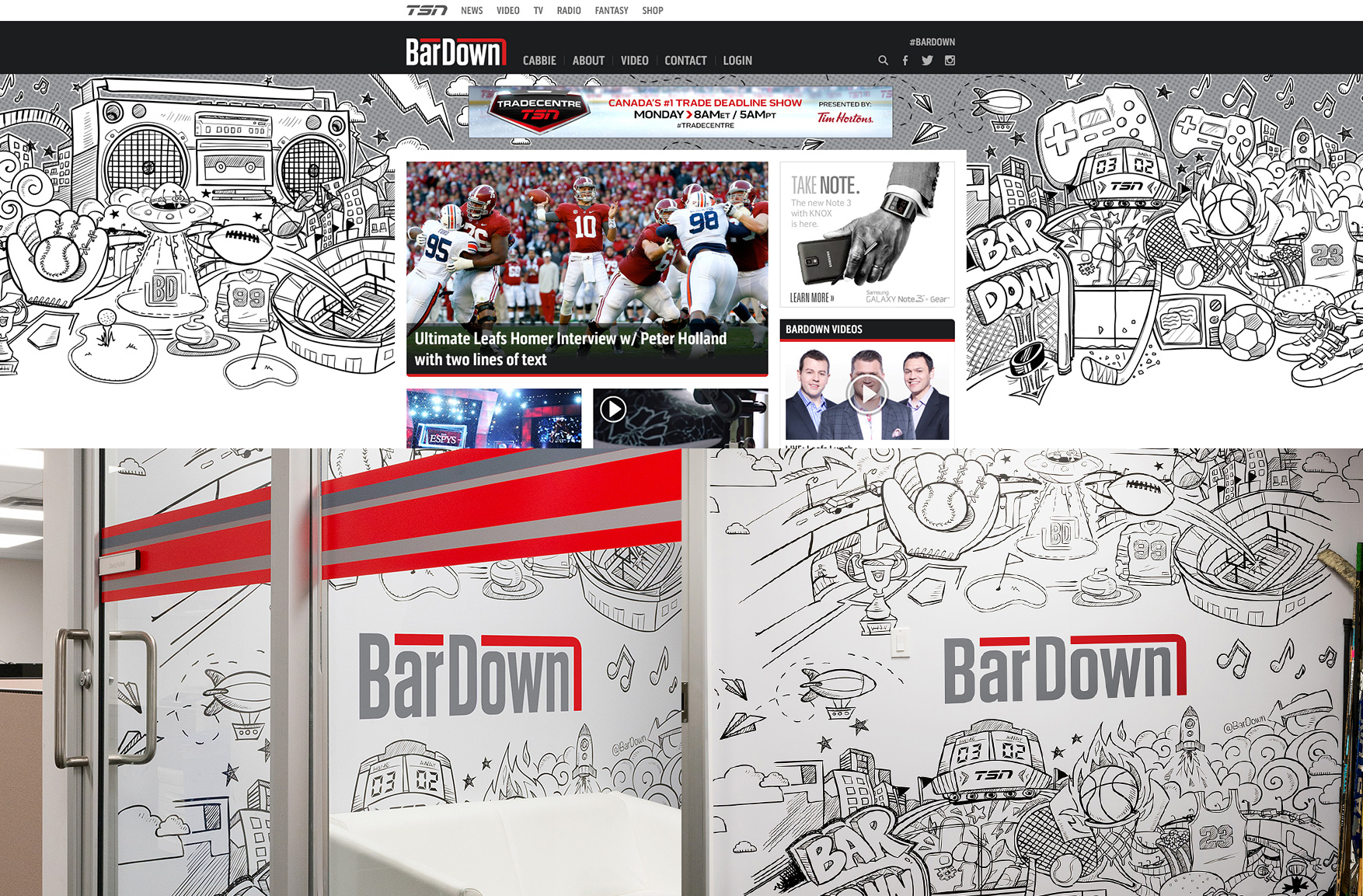 Tools
Tools
Photoshop, Illustrator
Collaboration
Creative Director, TSN stakeholders
A quirky and humorous segment on TSN known as “BarDown” needed branding and differentiation to stand out from the rest of the website. I decided to go with a non-traditional look which ended up being so successful they decided to use the art as a backdrop for their live segments.
9
9 Social Headers | Social Marketing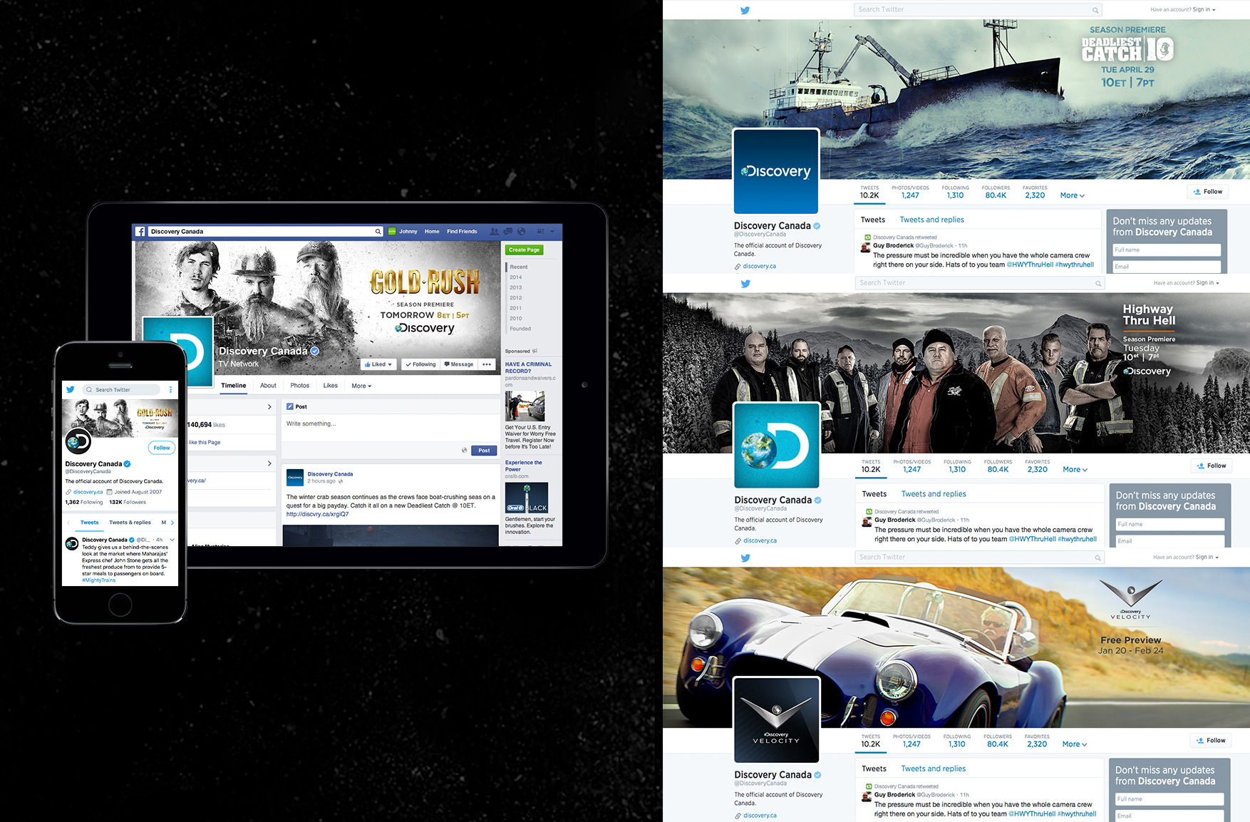 Tools
Tools
Photoshop
Collaboration
Creative Director
Social brands change their templates on a regular basis and part of my job is to keep up to date on the latest guidelines and share that with the rest of the team. The challenge is to test browsers and apps across desktop, tablet and smartphone to determine the safety zones and optimize the design (especially the messaging) to be effective at any size.
10
10 Discovery GO | Product Launch, Hub & Marketing Tools
Tools
Illustrator, InDesign
Collaboration
Creative Director, Marketing
I was tasked with creating a responsive hub that easily explained our brand new product: Discovery GO. I used a brochure-styled layout, with easy-to-understand images and descriptions. To help explain things clearly, I placed helpful instructions right at the top of the page: 1) The brand logo, 2) Visual of a group of devices showing the product in action and 3) The logos below the devices displaying the available channels.
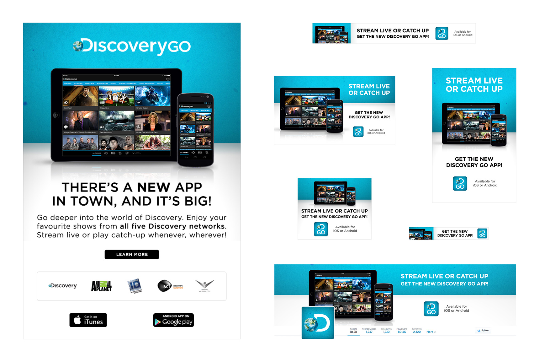 Once on-air finalized the art direction, I had to create a variety of different ad sizes, each with varying amounts of copy. Not all sizes are shown above and there were multiple avenues of marketing used to promote: websites, newsletters, social posts, etc.
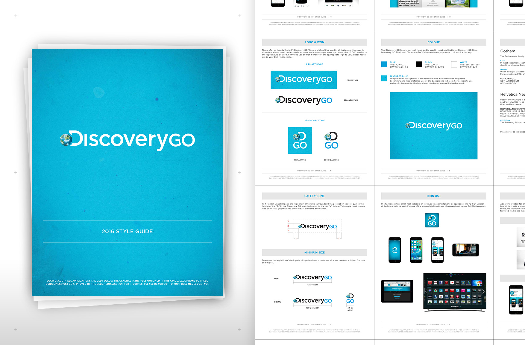 After the Discovery GO launch, we needed a guide for designers from third parties or anyone working on it internally. I made a comprehensive guide covering the basics like logo, colour, font, etc. and included as many use-case scenarios that I could think of.
11
11 Exploration Production Inc. (EPI) | Website Re-design Objectives
Our job was to create a website that acted as a sales tool to educate, promote and sell tv content to broadcasters internationally for EPI. The company is based in Ontario and had to comply with Accessibility for Ontarians with Disabilities Act (AODA), a law that dictates following the Web Content Accessibility Guidelines (WCAG) level A.
Tools
Photoshop, Illustrator, Adobe Analytics, UXPin
Collaboration
Creative Director, Product, EPI (the client), Front End Dev
 A) Requirements
Our team created an 18 page Business Requirements Document (BRD) that identified all the required components, goals, objectives and details like multi-language support. After that we worked with the client to make sure we understood their objectives and researched to clarify the unknowns.
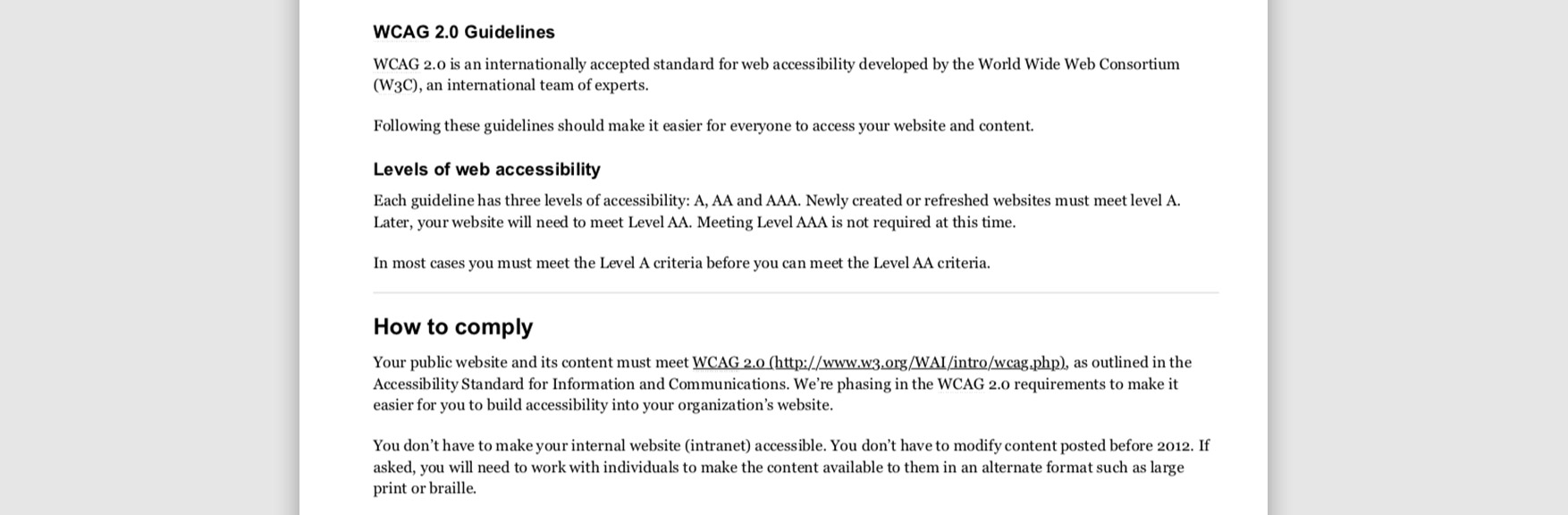 B) Accessibility
We followed Accessibility for Ontarians with Disabilities Act (AODA) and researched the Web Content Accessibility Guidelines (WCAG) to makes sure I understood the appropriate accessibility rules to work with. Starting in 2014 level A guidelines must be followed and starting in 2021 level AA guidelines must be followed. For the time being we used level A only.
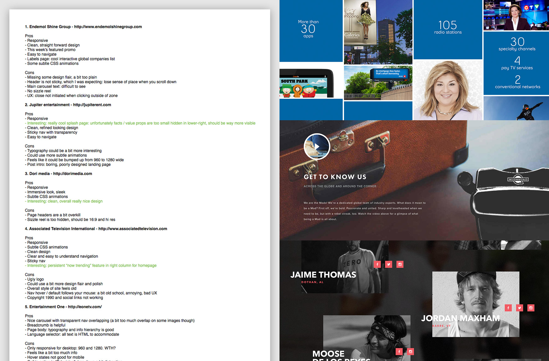 C) Comparative analysis
I did a comparative analysis to see what the competition had. There were a variety of online experiences that gave us ideas and we took the best of them as a basis of inspiration. Out of 45 companies and their websites, I choose to analyze 11 in-depth.
 D) Mood board & sketches
We created a mood board to help us brainstorm the design direction. I also made sketches on paper and whiteboard to put down creative ideas.
 E) Interactive wireframes
I used UXPin to create interactive wireframes (or a low-fi prototype) to help us, including the client, get a better understanding of the User Experience (UX). The wireframes were also responsive, so as you shrink down the browser, it would change views between desktop, tablet and smartphone. We refined it over 15 versions.
Overall, we kept the client in the loop at every step of the way and were transparent with all our decisions. For any ideas they had that were not ideal, we would always suggest better options and justify the benefits using pros and cons weighted against the requirements.
 F) Iconography
For the creative direction, we were going for a sleek and minimal look. I created a set of icons that were simple and easy to understand. Since we were device agnostic and resolutions of tablet and mobile went as high as 400% pixel density, we decided to use SVG vector format for all logos and icons to keep things looking sharp.
 G) Early mockups
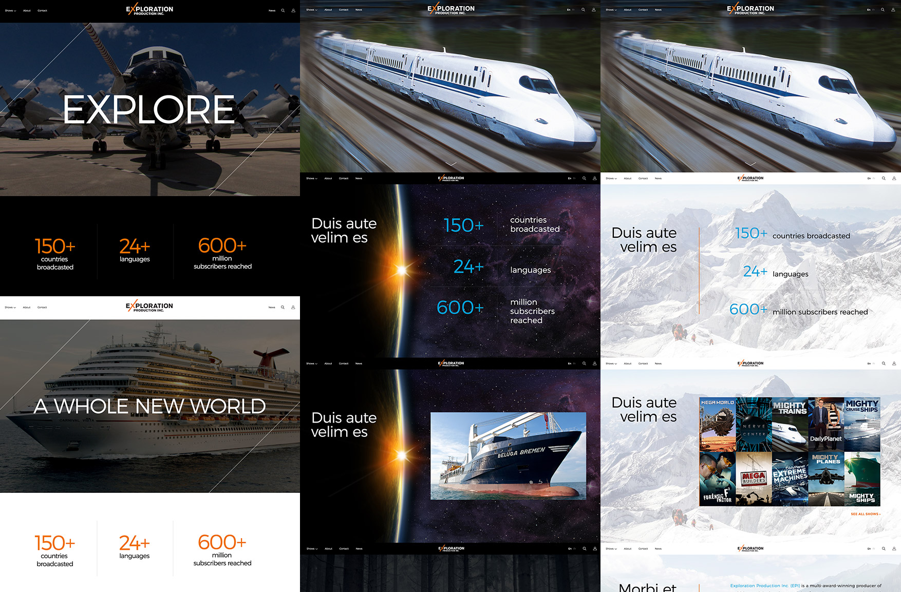
We did a variety of mockup explorations to narrow down a good design. Our biggest decision was to either go with a predominantly light looking site or a dark one. We felt the dark look brought about a more cinematic feel and helped focus on the video content, the main product EPI is selling.
 H) Final mockups and UX feature: Device agnostic
For the final mockups, on the homepage, we decided to have a full screen, short, looping video reel to highlight the company’s best work. It made the site feel relevant, exciting and was paced to capture your attention immediately.
To work with a global audience, our overall goal was to make this website work on any screen size, browser and platform. To achieve this, we created a 100% width fluid website with MP4 video and universal base ingredients of HTML, CSS and JavaScript.
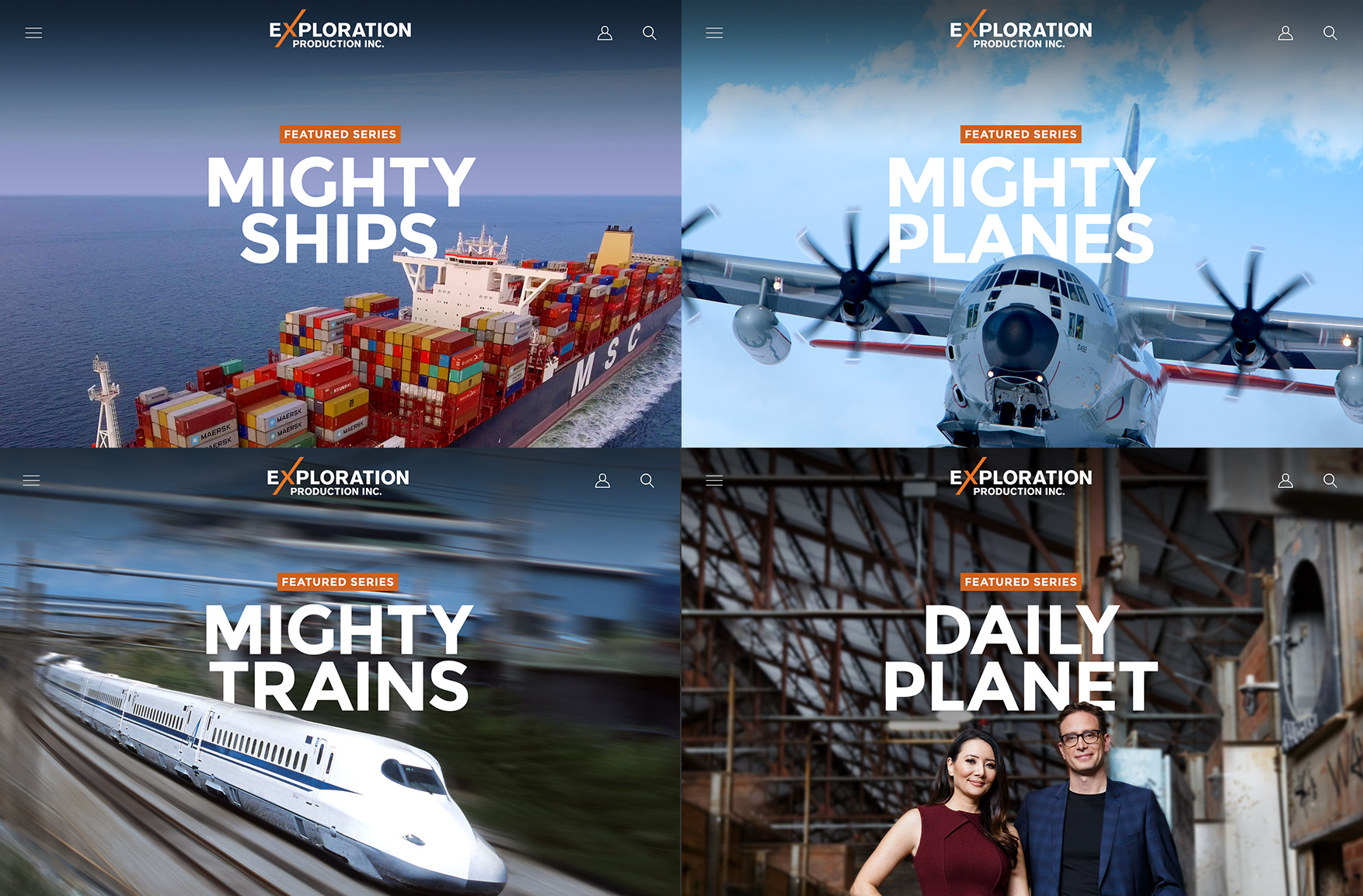 I) Video alternate images (homepage reel)
Since our audience was global, I researched stats and on the most popular devices and browsers for desktop, tablet and smartphone. Old versions of certain tablet OS’s don’t support HTML video auto play and we didn’t want to overwhelm smartphones with low processing power or limited data plans. So, we prepared video alternate images for those devices.
 J) Photo art direction
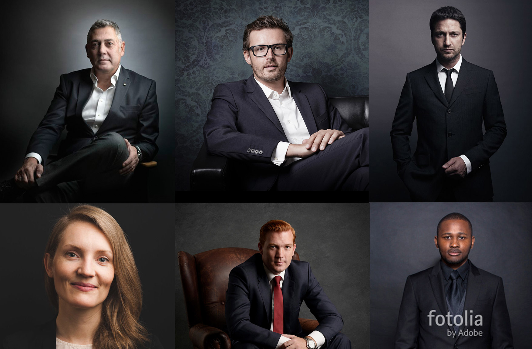
In order to capture business-like, friendly, co and good looking photography that matched the website, I provided art direction to the photographer hired to shoot the EPI team.
 K) UX feature: Multi-language
For launch, we had to design support for 7 languages and were told more would come down the line. Every component had to be designed with text flexibility.
 L) Client Login
We created a login area for clients to view custom video playlists to make final decisions before purchase. The sign up, login and playlist area were thoroughly thought out to make video viewing possible on any device. Our goal was to make an easy and enjoyable experience, one that a potential client could return to in order to buy more content.
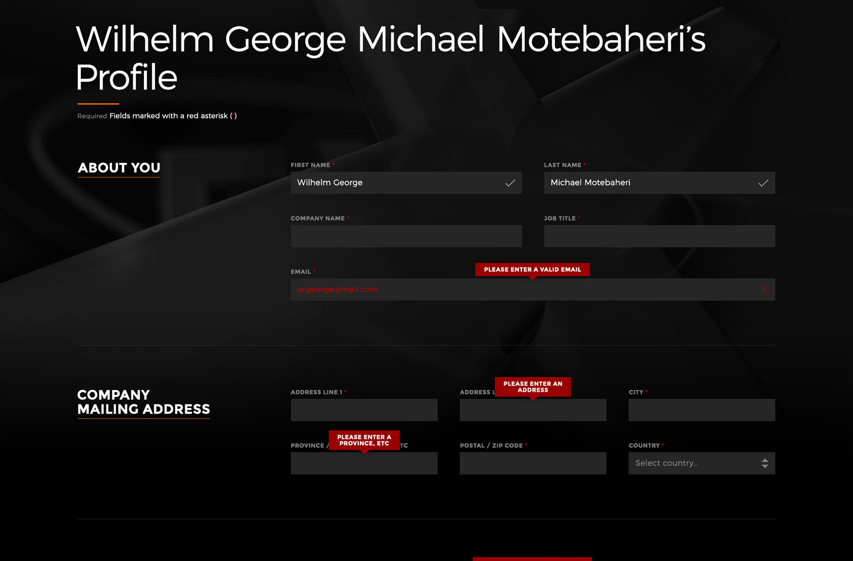 M) UX feature: Sign up form
The sign up field was designed to be clean, organized an easy to fill out. We used clear and in-context error messages that verified each field as you filled it out.
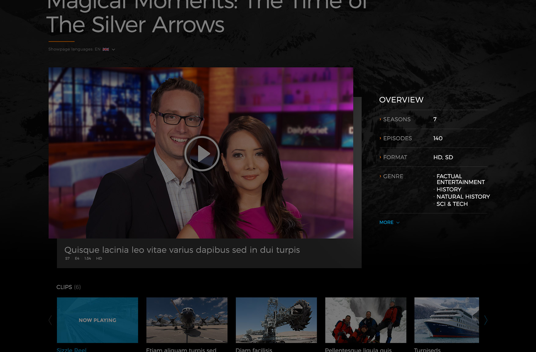 N) UX feature: Video summary
For each video we gave a high level summary of important information located directly to the right of the video. A “more” anchor link would bring the user down the page to the details. This would cover users who wanted to quickly skim the videos and also ones who would want to go deeper.
 O) UX feature: Show filter
By default, we showed all videos and alphabetical order. In addition, we added a detailed filter to quickly narrow down content. This works for both people who are just browsing, not knowing what they’re looking for and people who know exactly what they want.
 P) Dev style guide & device testing
I proved the front end developer with a 315 lines of style specification in an excel spreadsheet. For animations, I wrote down a description and provided a linked to a live demo (sometimes with code) in order to visually explain what we were envisioning. Most of our animations were on the homepage and parallax based.
We did testing on MAC, PC, iOS and Android tablet and smartphone, and all the major browsers to verify that everything worked. For animations, video and basic structure, our main ingredients were HTML, CSS and JavaScript so we did not run into major issues.
final thoughts
My team and I worked immensely hard on this project. We were extremely thorough and I am very proud of this.